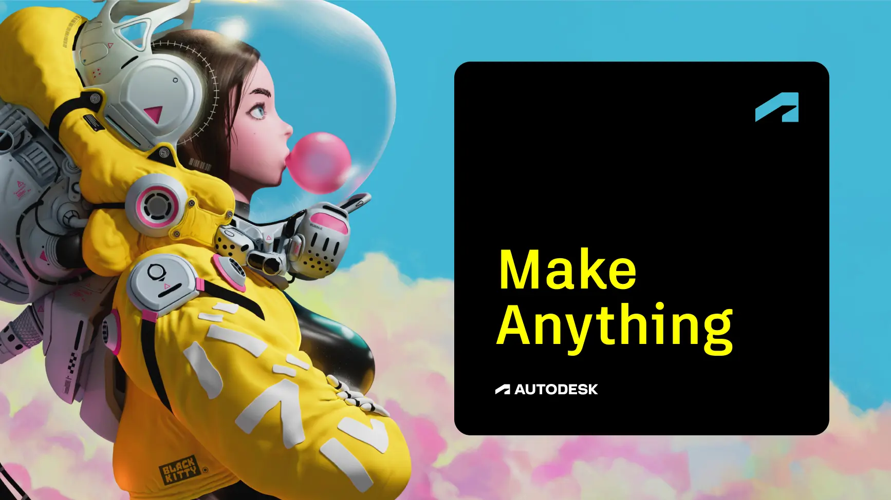
Autodesk’s tagline, “Make Anything,” reflects our mission to empower everyone, everywhere, to solve challenges big and small. It can appear in copy, in a lockup with our logo, or as a headline on its own, anywhere Autodesk’s promise needs to be summarized as succinctly as possible.
Tagline lockup Copy link to clipboard
Our tagline is often paired with variations of our logo in lockups. Our tagline lockups should only ever be used in Autodesk Black (preferred) or Autodesk White against sufficiently dark backgrounds.
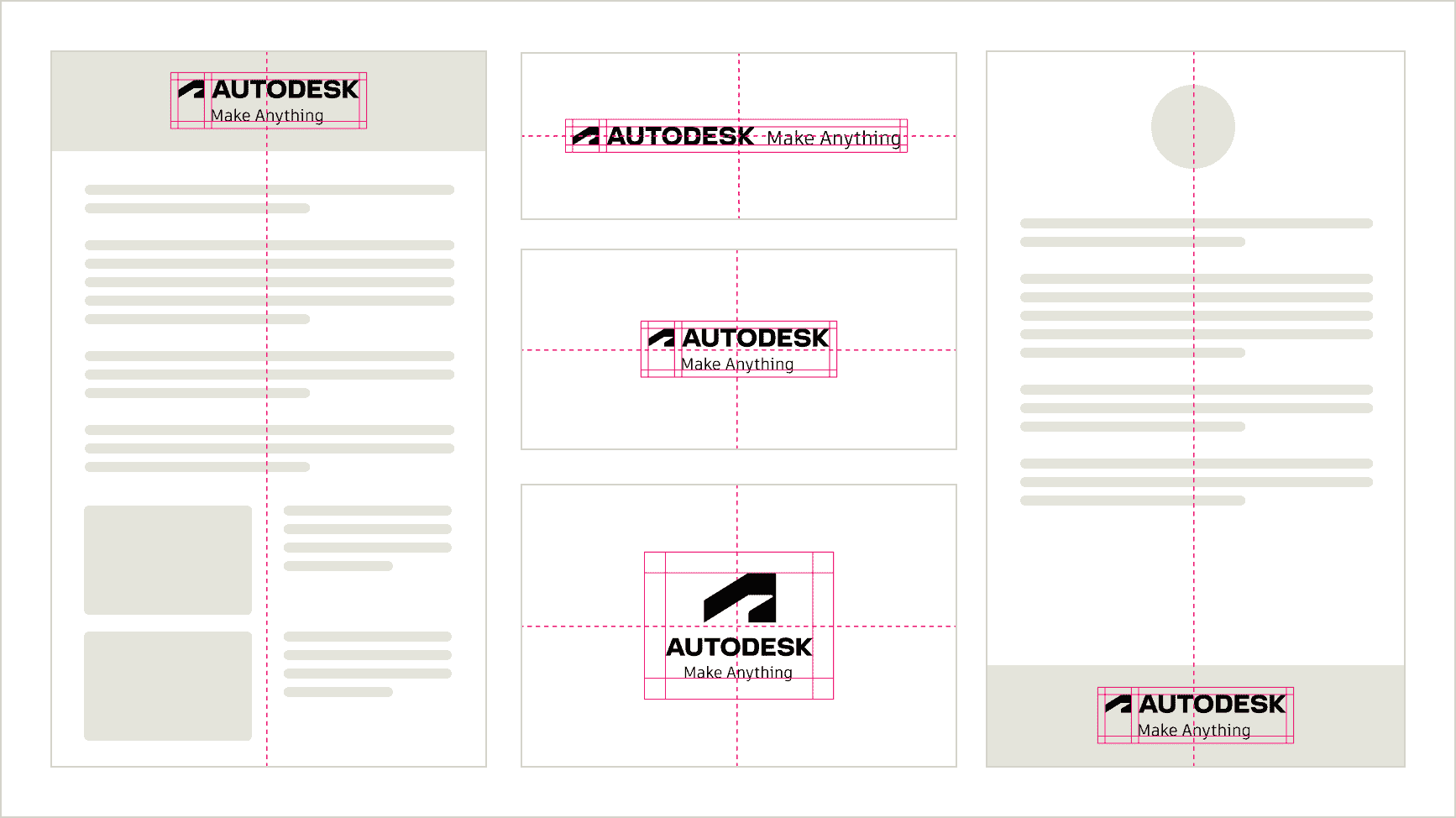
Like the Autodesk logo, the tagline lockup comes in three variations. Use tagline lockups in digital or print assets, whenever the tagline helps reinforce the story being told.
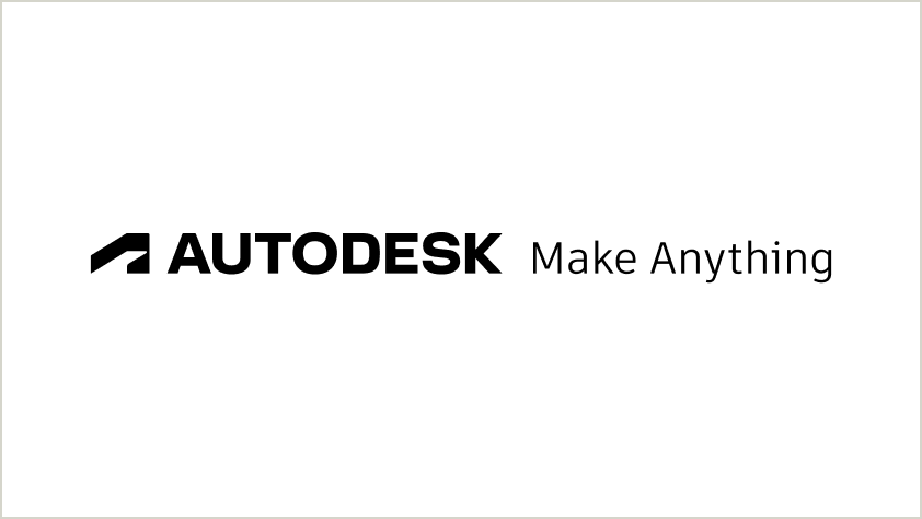
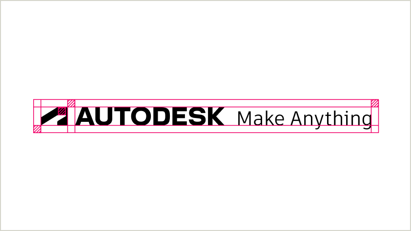
One-line tagline lockup
The logo, including the symbol, and the tagline sit together on the same horizontal line.
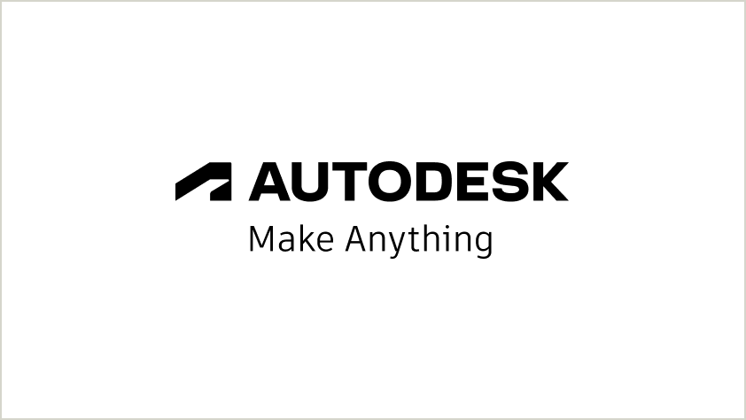
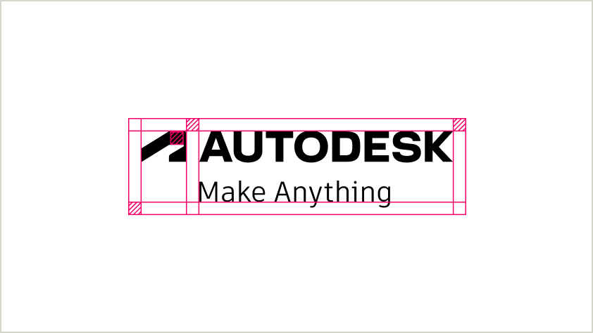
Stacked tagline lockup
The logo, including the symbol, sits above the tagline.
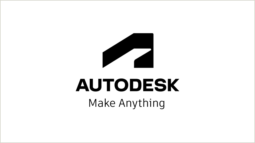
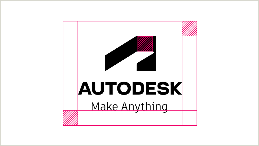
Alternate stacked tagline lockup
Stacked from top to bottom, this lockup includes the symbol, the wordmark, and our tagline.
Tagline lockup checklist Copy link to clipboard
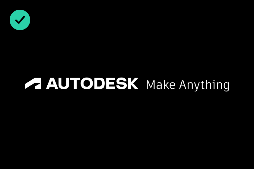
DO use an Autodesk White tagline lockup on an Autodesk Black background.
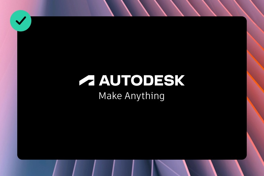
DO use an Autodesk Black tagline lockup on an Autodesk White background.
DO layer a solid color behind an Autodesk tagline lockup when placing it against a colorful textured background.
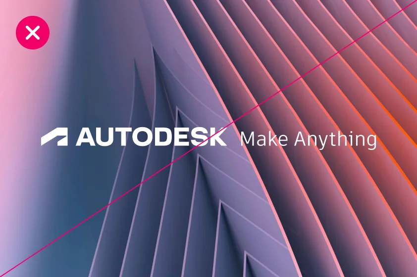
DO NOT use an Autodesk tagline lockup against a colorful textured background.
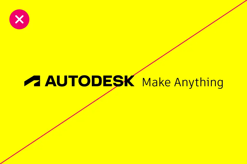
DO NOT place a tagline lockup on Hello Yellow. Autodesk’s parent brand identity is black and white.
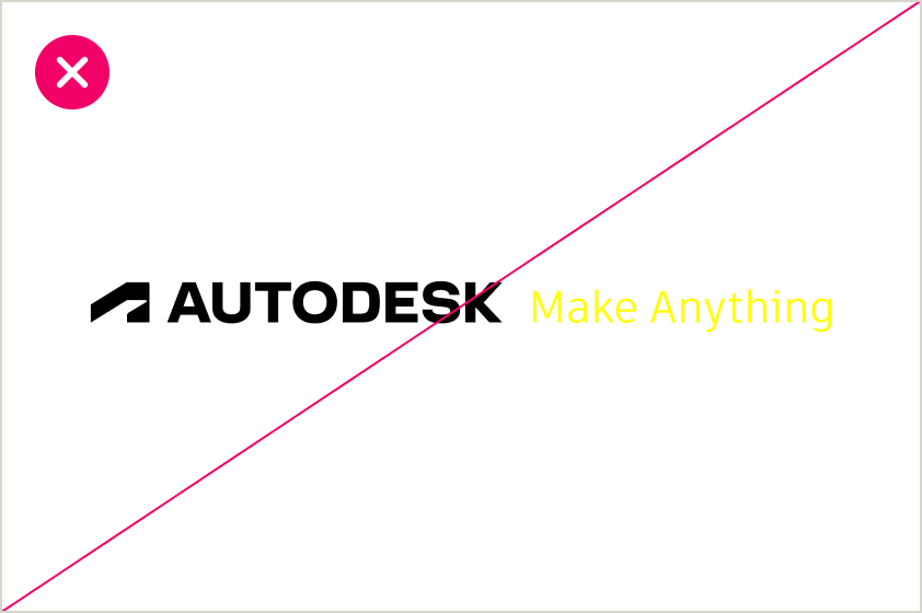
DO NOT use Hello Yellow for tagline lockups. The tagline lockup should only be Autodesk White or Autodesk Black.
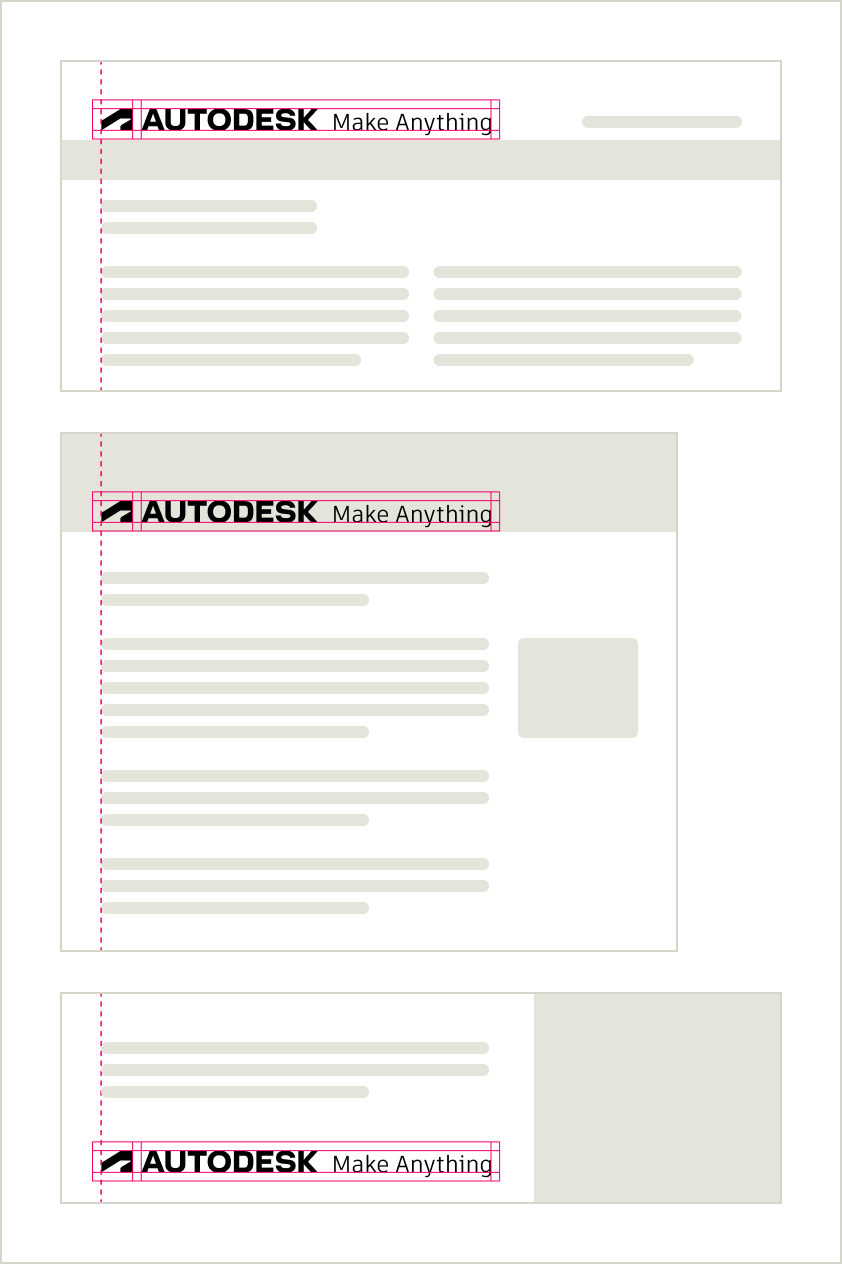
Lockup clear space Copy link to clipboard
Lockup clear space guidance follows how you would treat the Autodesk logo on its own. Use the height of the crossbar at the top of the abstract “A” symbol (see below) as a guide to ensure every use of a tagline lockup has enough breathing space.
One-line tagline lockup
The additional length of the one-line tagline lockup makes it most appropriate for settings with ample room horizontally to maintain sufficient breathing space.
Stacked tagline lockup
The stacked tagline lockup helps maintain adequate breathing space in narrower settings that allow for the added height of two lines while maintaining the space between the logo and the lockup. It is the preferred stacked variation.
Alternate stacked tagline lockup
The alternate stacked tagline lockup can be used in narrow settings.
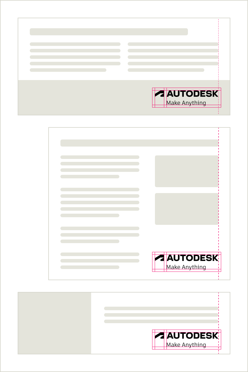
Lockup placement Copy link to clipboard
The guidance below is similar to how you should place a stand-alone Autodesk logo. The tagline lockup should always appear in a prominent, intuitive place. Always be sure the tagline lockup appears with a high enough contrast to its background that its edges are clearly defined and the wordmark and tagline are legible. Refer to the color contrast chart on the Color page for more details.
Left-aligned
Right-aligned
Center-aligned
Using our tagline Copy link to clipboard
Where and when should we use our tagline “Make Anything”? Any time we have an opportunity to make a statement about what Autodesk stands for.
Important note: Our tagline is “Make Anything” while our brand promise is “Design and make a better world for all.” When using the tagline, never include the beginning of our brand promise. Our tagline is “Make Anything,” not “Design and Make Anything.”
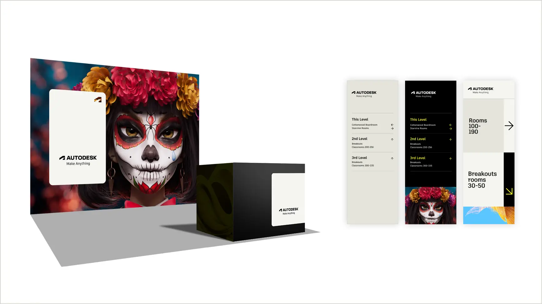
As a lockup on event booths or signage.
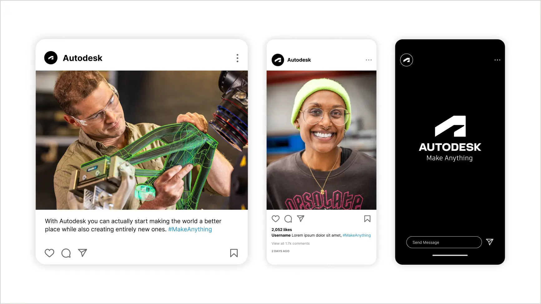
As a lockup, stand-alone headline, or hashtag on social media posts, the tagline should be title case (capital “M” and capital “A”).
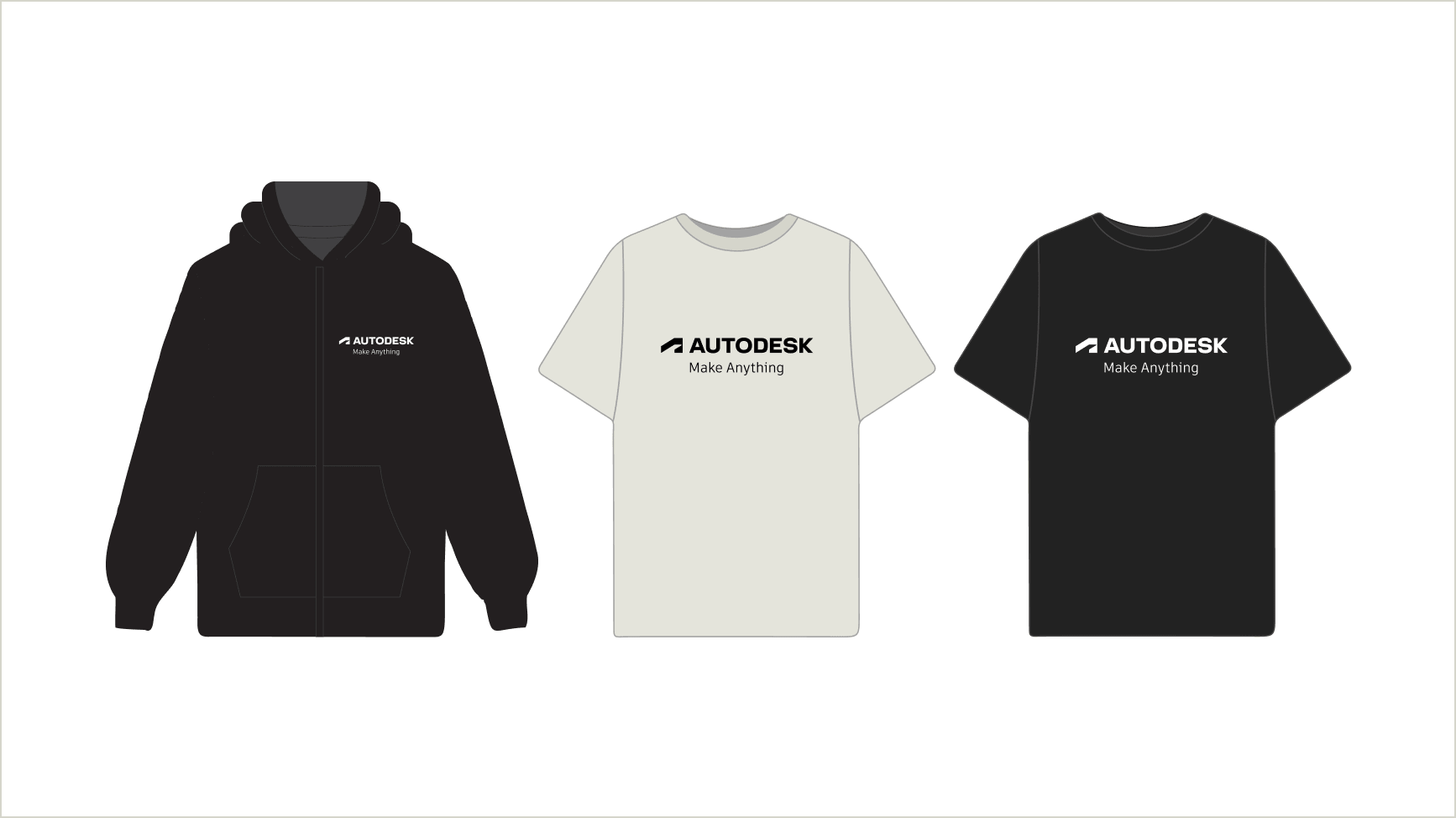
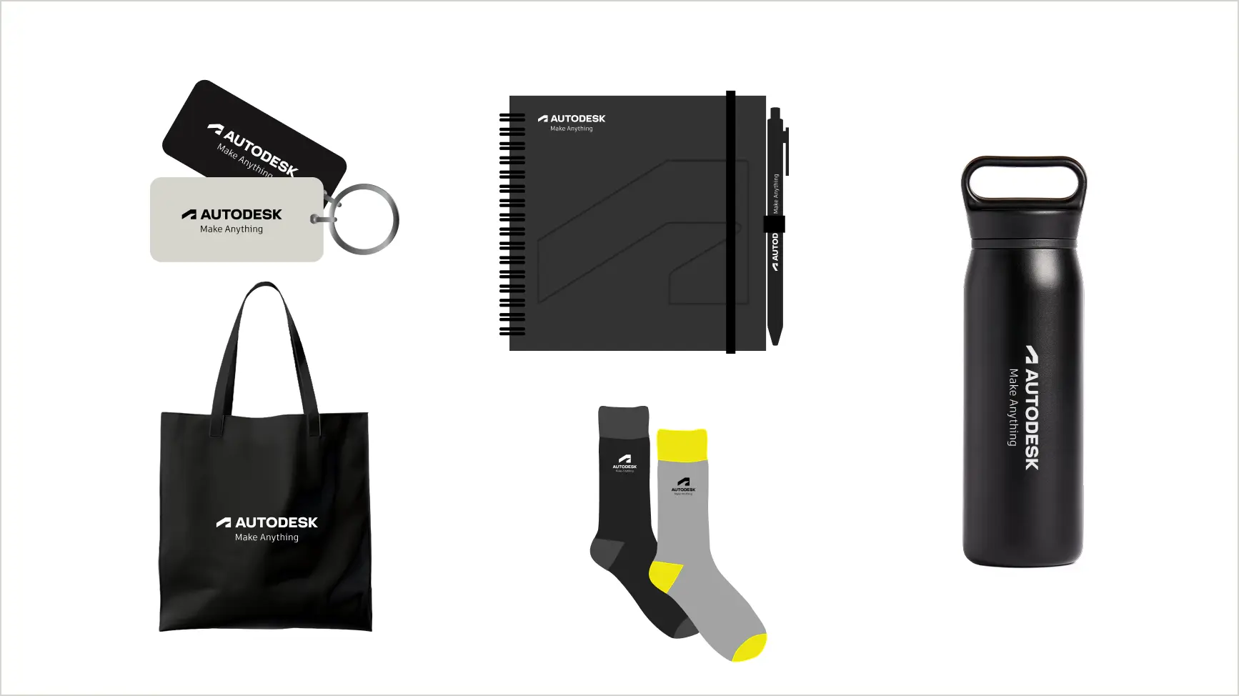
As a lockup or stand-alone headline on branded merchandise, the tagline should be title case (capital “M” and capital “A”) and in Artifakt if not included in a lockup.
As a stand-alone headline Copy link to clipboard
When presented as a stand-alone headline, “Make Anything” should use title case (capital M, capital A) without any TM mark. Do not use a period.
In body copy Copy link to clipboard
The line “make anything” can be used in body copy but use it sparingly.
When used in a sentence, apply appropriate spelling rules (e.g., don’t capitalize “M” or “A” in the middle of a sentence).
While the tagline itself should not be localized, when used in copy (as in the example above), it needs to be translated. Keep in mind that, when translated, the line “make anything” will lose its brevity and distinctiveness.