Autodesk’s visual devices, the thread and the window, are ways to emphasize the importance of our customers and the things they design and make. They instantly create a perceptible connection with the Autodesk brand.
The window and the thread are deployed using a flexible system built on the foundations of our symbol, our primary brand colors, and thoughtful choice of images. Using them consistently builds brand awareness and trust.
Our visual devices Copy link to clipboard

The thread
The thread, a thin outline of our symbol, shows how Autodesk is woven into our customers’ stories and success. It illustrates our dynamic partnership with them. The thread’s flexibility allows us to manifest our role in our customers’ ability to design and make anything.
The window
The window uses our symbol to provide a look into the world Autodesk customers design and make and the many industries Autodesk impacts. It invites the viewer to dive deeper, representing our critical role in our customers’ design and make journey.
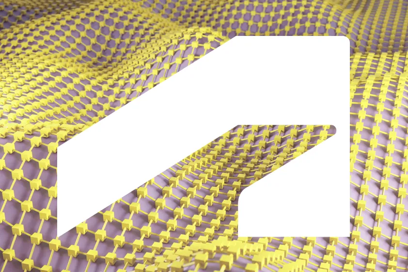
The window Copy link to clipboard
The window uses our symbol to provide a look into the world Autodesk customers design and make and the many industries Autodesk impacts.
The window can be used in two different ways: either as a mask giving a look through, or as an opaque Autodesk Black or Autodesk White overlay. The window works best with intriguing textural images that evoke our customers’ industries. You can find a curated set of images that work well with the window on the DAM (access required).
The window should be used in settings without a lot of supporting text where the Autodesk brand is already firmly established. Assets containing the window must always include an Autodesk logo. Visit our Events page to see special rules for event settings.

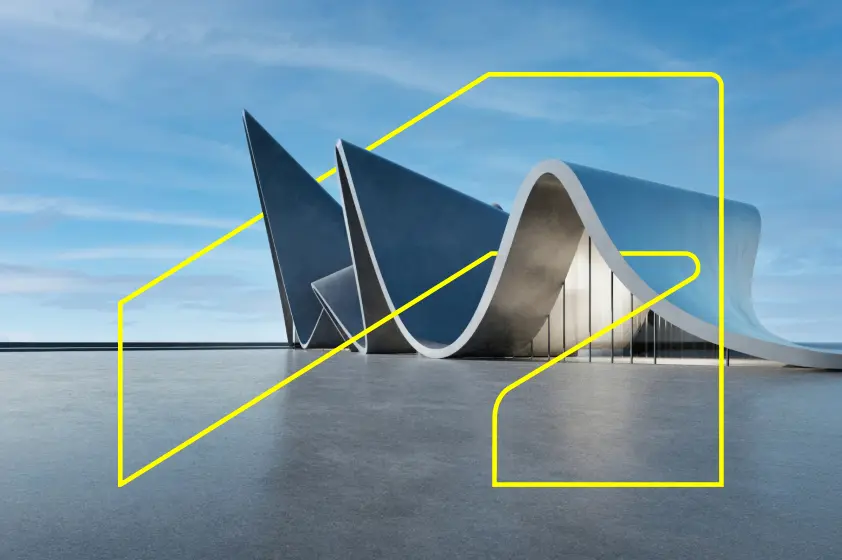
Symbol masking a photo
The Autodesk symbol used as a window looks through to an intriguing abstract texture that calls to mind an Autodesk customer industry.
Autodesk symbol in the foreground
The Autodesk symbol used as a window overlay establishes Autodesk’s role in customers’ design and make process.
Choosing images for the window Copy link to clipboard

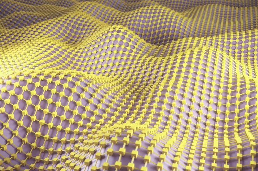


Engaging textural images work best with the window. They provide an intriguing fill or background to highlight the symbol silhouette clearly without overwhelming it.
Choose images with bright colors that abstractly reference our customers’ industries—you can find a curated set on the DAM (access required). Because the window doesn’t use Hello Yellow, consider images that include pops of yellow. Do not include people in assets that use the window.
Using the window Copy link to clipboard

DO ensure the focus of the image is clearly and elegantly framed in or around the symbol, and not awkwardly cut off.

DO ensure sufficient contrast between the window as an overlay and the image behind it. Choose Autodesk Black or Autodesk White accordingly.
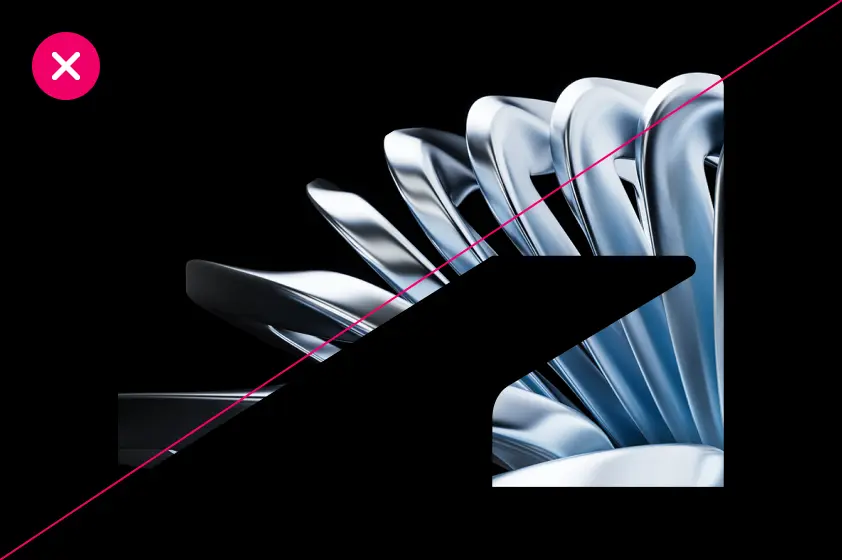
DO NOT insert any image or texture that blends into the symbol, making its shape less clearly defined.
DO NOT frame people or people-like objects (e.g., animated characters or robots) within the window. The strength of the window as a visual device is how it generates curiosity and an interest to dig deeper and learn more.
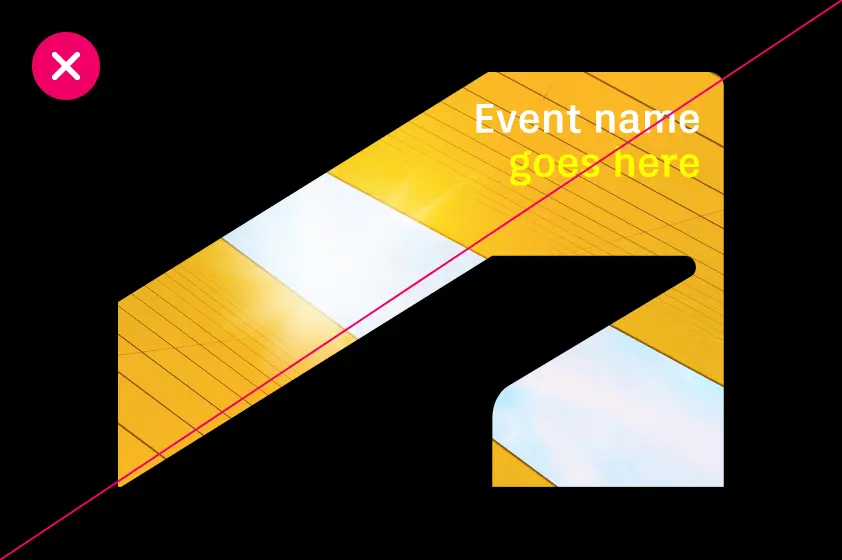
DO NOT insert any copy or headlines into the shape of the window.
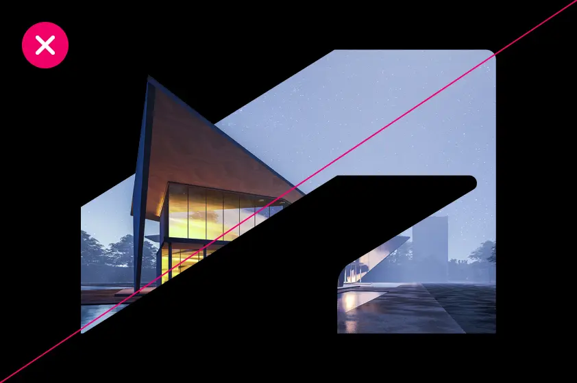
DO NOT allow any element of an image to break outside of the shape of the symbol. Doing so compromises the integrity and clarity of the symbol.
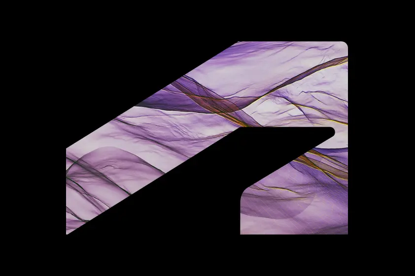
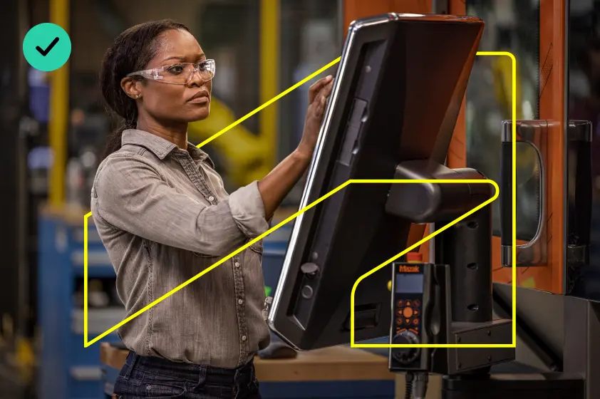
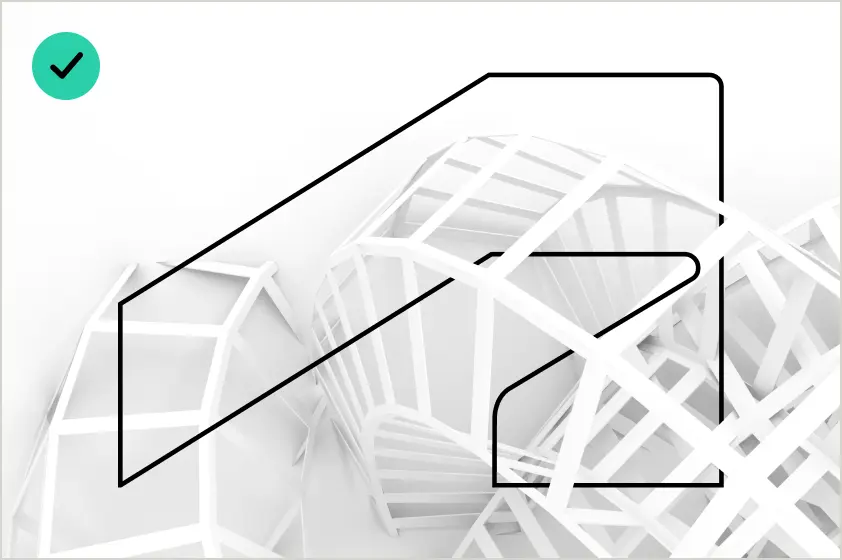
The thread Copy link to clipboard
The thread, indicated by a thin outline of our symbol, shows how Autodesk is woven into the very fabric of our customers’ stories and successes.
The thread should weave into and around images of Autodesk customer products and can include people when thoughtfully chosen and arranged. It should not simply frame the product or image.
Be especially mindful of awkward or unintentionally constricting uses of the thread with people, animals, people-like things (e.g., animated characters and robots), and products. If your use of the thread doesn’t use Hello Yellow, consider images that include pops of yellow.
Important note: Use of the thread always requires explicit permission from the Autodesk Brand Creative Team because of important issues regarding legal image permissions. Only use Autodesk-approved thread assets—do not create your own.
Contact brand@autodesk.com about any instances where you’d like to use the thread.


Choosing images for the thread Copy link to clipboard
Choose images with a clear sense of depth and relationship. The thread is meant to show how Autodesk is seamlessly woven into the process of designing and making. Images that allow the thread to play with depth and use both the background and foreground of the setting—without being excessive—are ideal.
Images must be simple and low contrast—either overall dark or overall light—to allow the thread to be clearly visible. People can be used in assets containing the thread, but the thread should not be used as a framing device.
Using the thread Copy link to clipboard
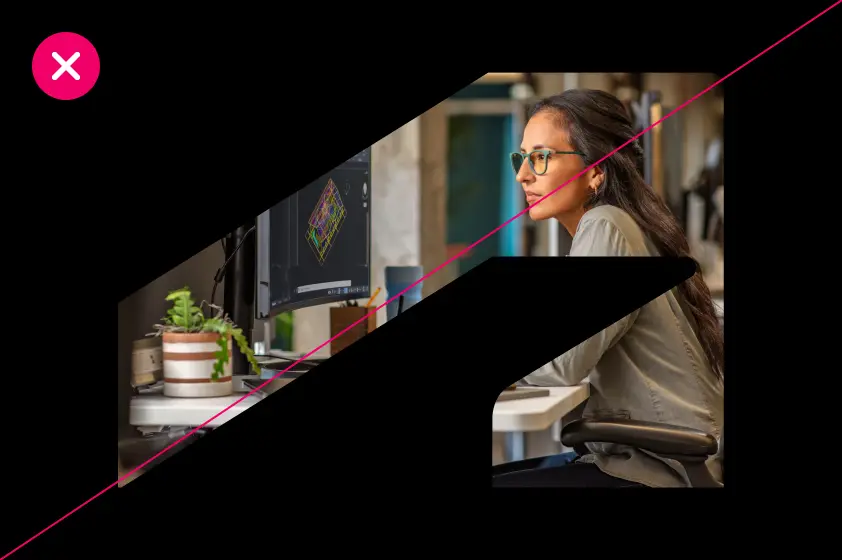
DO ensure a clean, elegant, and simple composition when using the thread, and that it isn’t simply framing something in the image.
DO only use the thread in Autodesk White, Autodesk Black, or Hello Yellow.

DO ensure high contrast of the thread against the background image (Autodesk White or Hello Yellow on dark backgrounds, Autodesk Black on light backgrounds).
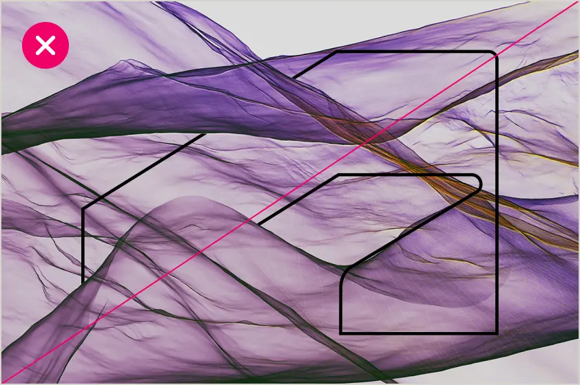
DO NOT use an image or texture that blends into the thread, making the shape of the symbol less clearly defined.

DO NOT place the thread in a way that is overly constricting with people, animals, or humanoid objects like robots.
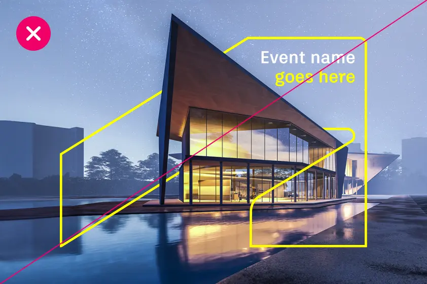
DO NOT place any copy inside the thread.
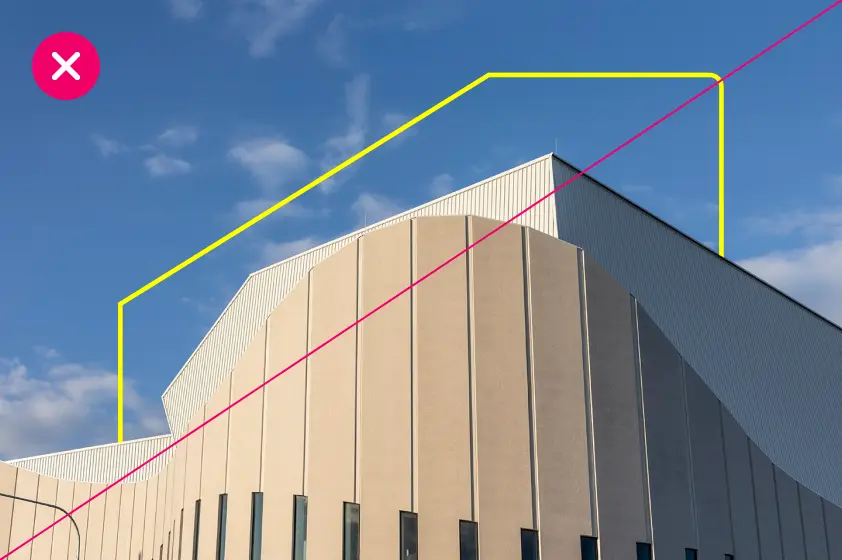
DO NOT allow any element in an image to cover the shape of the thread excessively.