Of the many ways our audience connects with Autodesk through various touchpoints and experiences, our campaigns are some of the most visible and story-driven. Deployed successfully, they help shape how our audience sees and thinks of us. Campaigns have a unique responsibility to build brand recognition and establish trust with our audience—some of whom will be learning about Autodesk for the first time.
Regardless of your campaign initiative or its stage in the customer journey, strive to maintain the singular Autodesk brand experience. We always want to look, sound, and feel unified as one Autodesk.
Campaign framework Copy link to clipboard
Campaigns consist of various asset types aligned to achieve a specific goal and developed with coherent, connected story-driven messaging and visuals. Our campaign framework establishes the foundation for creating visually cohesive and impactful assets. It combines fixed elements that ensure consistency across all designs and flexible elements that allow for creativity and adaptability to meet the needs of specific audiences and platforms. By adhering to this framework, you can confidently build assets that align with our brand identity while delivering narratively engaging, results-driven campaigns.
Fixed elements Copy link to clipboard
Fixed elements are the foundational components of every campaign asset, ensuring brand consistency and recognition across all touchpoints. These elements must be applied uniformly in all designs to create a cohesive visual identity that strengthens the brand and builds awareness and trust with our audience.
The fixed brand elements which must be present for campaigns are:
- Layout system
- Color palette
- Typography
- Button style
- CTA
- Logo
Fixed campaign elements checklist Copy link to clipboard
DOs. Here are some best practices to keep in mind when designing your campaign assets.
- Use approved logo variations only.
- Ensure proper sizing, spacing, and placement of the logo. Avoid stretching or distorting the logo.
- Use Artifakt Legend Bold for all headlines and subheads. Use Artifakt Element Regular for body copy.
- Use the primary brand color palette as the foundation for all designs.
- Align all content to the 4px grid system.
- Use the provided layout templates to ensure uniformity across platforms.
Flexible elements Copy link to clipboard
Flexible elements allow for creativity and adaptability in campaign assets while staying true to the unique Autodesk brand identity. These elements allow content to be tailored to suit specific audiences, platforms, or campaign goals while maintaining brand consistency.
The flexible brand elements you can use to customize your campaign are:
- Messaging/copy
- CTA messaging
- Imagery
- Background color and position
Flexible campaign elements checklist Copy link to clipboard
DOs. Here are some best practices to keep in mind when designing your campaign assets.
- Use authentic, high-quality visuals that align with our brand aesthetic. Strive for a premium look and feel.
- Avoid overly staged stock photos or low-resolution images.
- Headlines should be concise, impactful, and modulated to fit the appropriate tone within our brand voice for the stage of the customer journey.
- Body copy should guide the viewer naturally to the CTA.
- Use motion graphics sparingly to enhance, not distract from, the content.
- Maintain consistent sizes, styles, and spacing.
Messaging
Messaging is a key ingredient to a successful campaign. Make sure what you say and how you say it reflects our brand voice.
Tip: When creating product ads, include the product name in the headline when possible.
Imagery
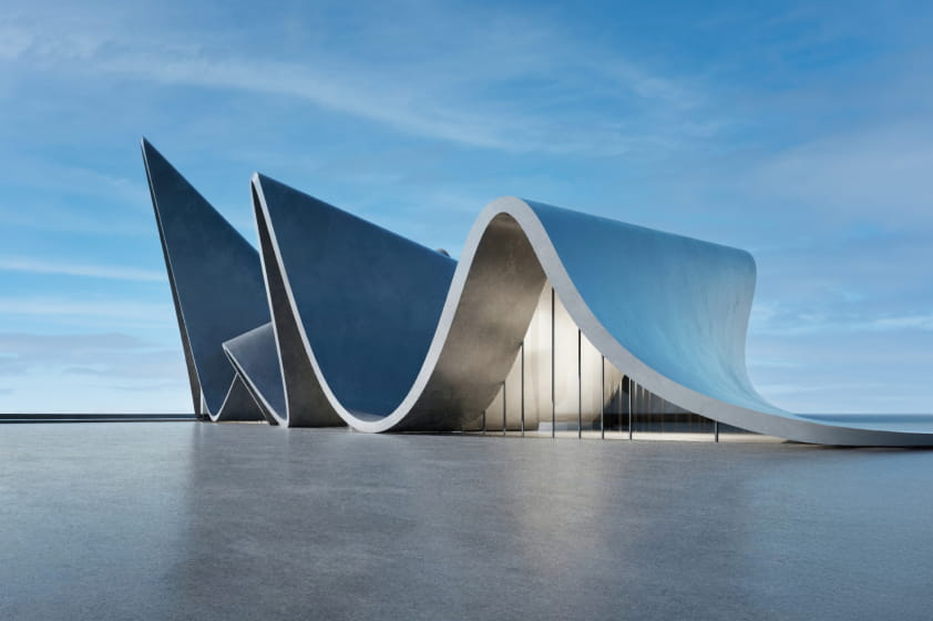
Compelling imagery captures your audience’s attention. Choose a single, impactful image to help reinforce your message. Choose images that can be used full bleed and that provide good contrast for typography layered over them. See Imagery for more.
Many campaign assets. One Autodesk brand. Copy link to clipboard
Campaigns consist of various asset types aligned to achieve a specific goal and developed with coherent, connected story-driven messaging and visuals. The guidance below provides tailored, best-practice design guidelines for creating high-impact assets across various campaign types and channels.
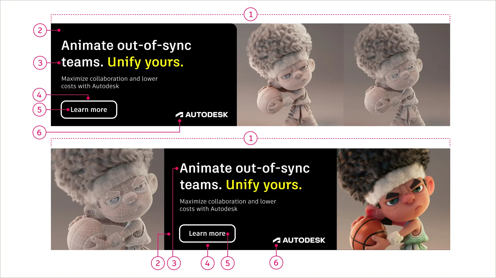
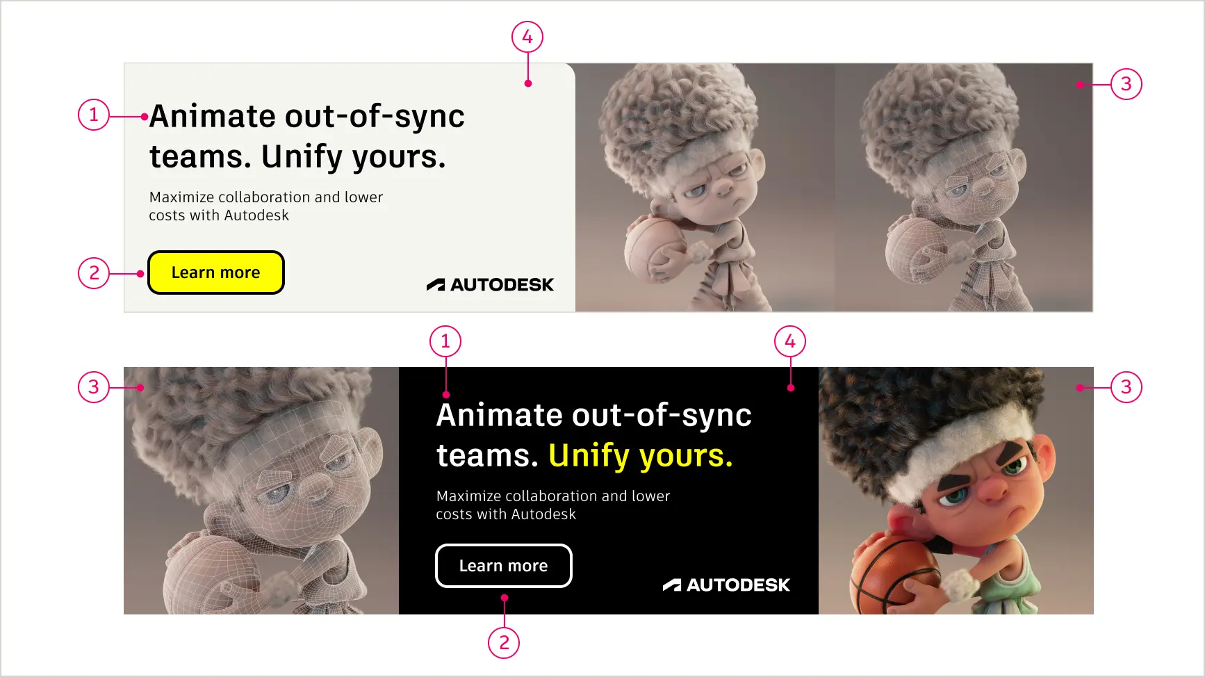
Display ads Copy link to clipboard
Display ads are visual assets designed to capture attention quickly and drive action across websites, apps, and digital platforms. They should feature a clear visual hierarchy, minimal but impactful text, and strong calls to action (CTAs) while being optimized for responsiveness and fast load times.
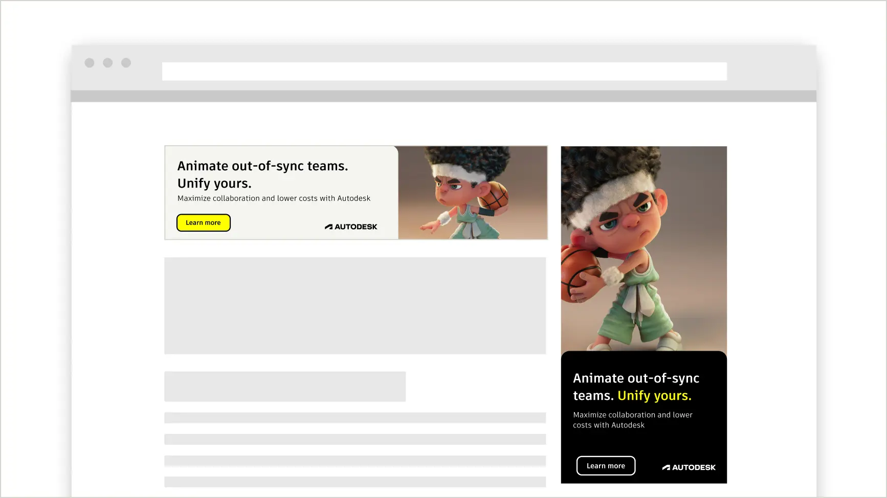
Display ad checklist Copy link to clipboard
DOs. Here are some best practices to keep in mind when designing display ads.
- Ensure the Autodesk logo, headline, and CTA are clear, prominent, and thematically connected.
- Keep headline copy concise. Aim for no more than 5–10 words. Ensure your use of the Autodesk brand voice is deployed in the tone appropriate to the stage in the customer journey.
- Subheads should be outcome-driven but concise.
- Optimize layouts for various screen sizes.
- Use bold imagery or graphics that align with the campaign theme and industry. Consider images in the DAM (access required) or visuals showing completed customer products or projects. Remember to include image credits when necessary.
- CTAs should be direct, clear, and appropriate to the stage of the customer journey. Consider more creative options, but the straightforward “Learn more” and “Buy now” deliver well consistently.
Download display ad templates (access required)
Paid social Copy link to clipboard
Social campaigns are designed to captivate audiences with visually dynamic, platform-specific content. They should prioritize mobile-first designs, bold imagery, concise story-driven messaging, and interactive elements to maximize engagement and drive action across channels like Instagram, LinkedIn, and TikTok.
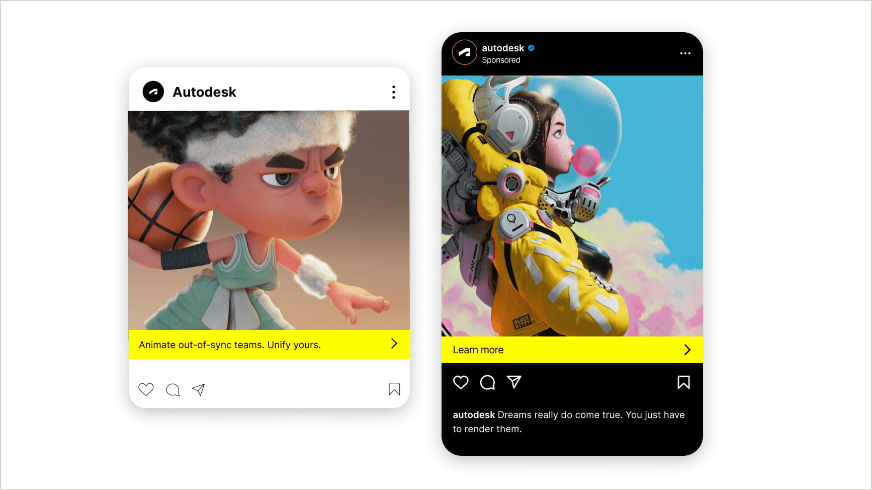
Social content checklist Copy link to clipboard
DOs. Here are some best practices to keep in mind when developing social content.
- Ensure visuals and text are legible on small screens.
- Use high-quality imagery or motion graphics that capture attention quickly.
- Keep text minimal and avoid covering key parts of the image.
- Leverage platform-native CTAs (e.g., “Learn more,” “Sign up”).
Email Copy link to clipboard
Email is a direct and personalized way to engage your audience, whether you’re announcing a product, sharing updates, or driving conversions. They allow for more text, but stay concise and direct. Effective email designs should prioritize clear layouts, compelling visuals, and strong calls to action. Ensure compatibility across devices for a seamless user experience.
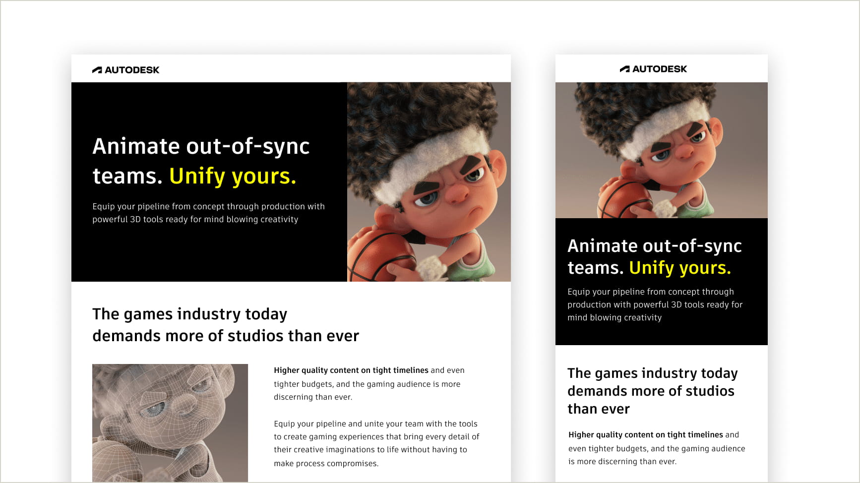
Marketing email checklist Copy link to clipboard
DOs. Here are some best practices to keep in mind when developing marketing emails.
- Make the header and CTA the most prominent elements.
- Ensure the email is visually engaging but not overloaded.
- Remember, our brand font, Artifakt, will not embed in email platforms. Use the system font Arial in its place for body text.
- Avoid using multiple CTAs to keep the focus on a single action.
- Test layouts on both desktop and mobile screens.
- Add alt text for all images and maintain high contrast for readability.
Campaign resources Copy link to clipboard
Here are additional resources and guidance for a successful campaign.