Events and experiential activations present singular opportunities to create lasting impressions. When hosting an Autodesk event, carefully consider how we make people feel and how they interact with our brand from the time they first hear about the event through post-event communications.
Whether a flagship event like AU, a virtual event, or a trade show, the experiences we create should surprise and delight, educate and inspire. They should provoke conversation and build community. While activations and messaging for events may vary depending on audience, region, budget, and other needs, they should all reinforce the Autodesk parent brand.
Finally, we believe in leading with positive impact in everything we do. We’re a net zero carbon company and we’re committed to sustainable practices across our business operations. Whether planning an in-person or virtual experience, consult this checklist of sustainability requirements (access required) and best practices for managing events.
Creative inspiration Copy link to clipboard
These mockups can serve as inspiration for deploying our brand in an event or experiential setting, offering models for how our brand should look and feel throughout an attendee journey. Note, they don’t represent an actual event. In general, always strive for an experience that reflects our brand and feels thoughtful, premium, and curated for your audience.
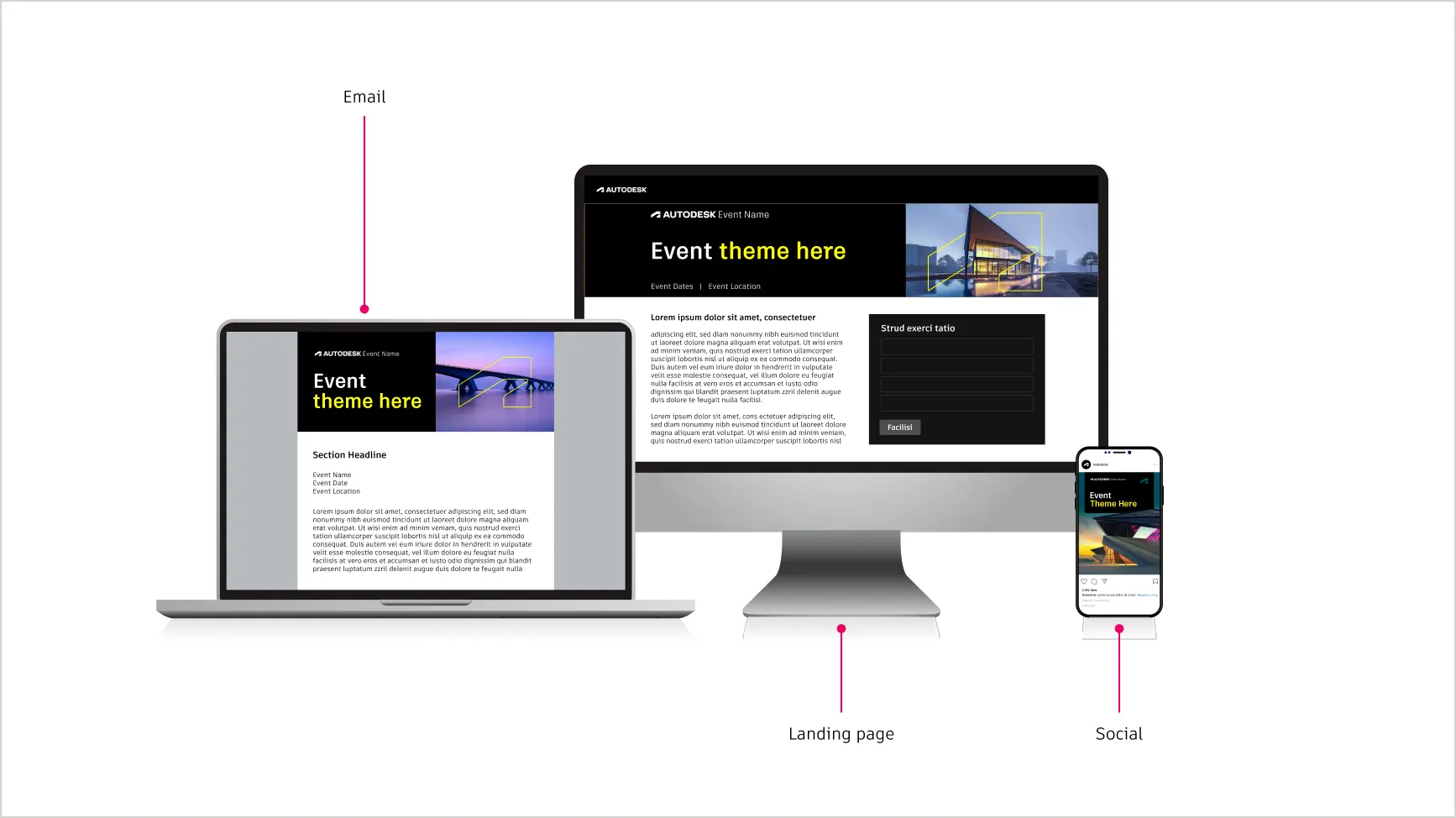
Pre- and post-event assets
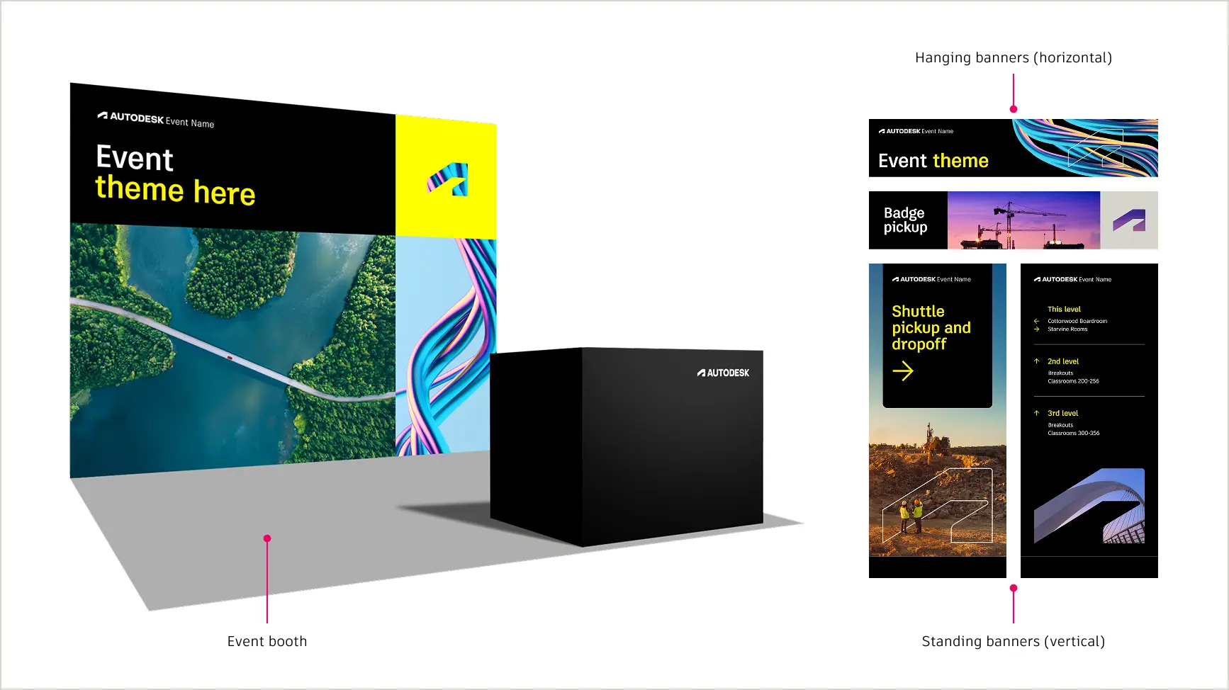
Physical event assets Copy link to clipboard
Physical assets should serve a purpose, like establishing a sense of place or providing wayfinding and session information to ease and enhance an attendee’s journey. They also help establish an Autodesk-branded setting and tell the event’s thematic story. Consistency in brand implementation across physical assets helps unify the experience and make it memorable while enhancing the message.
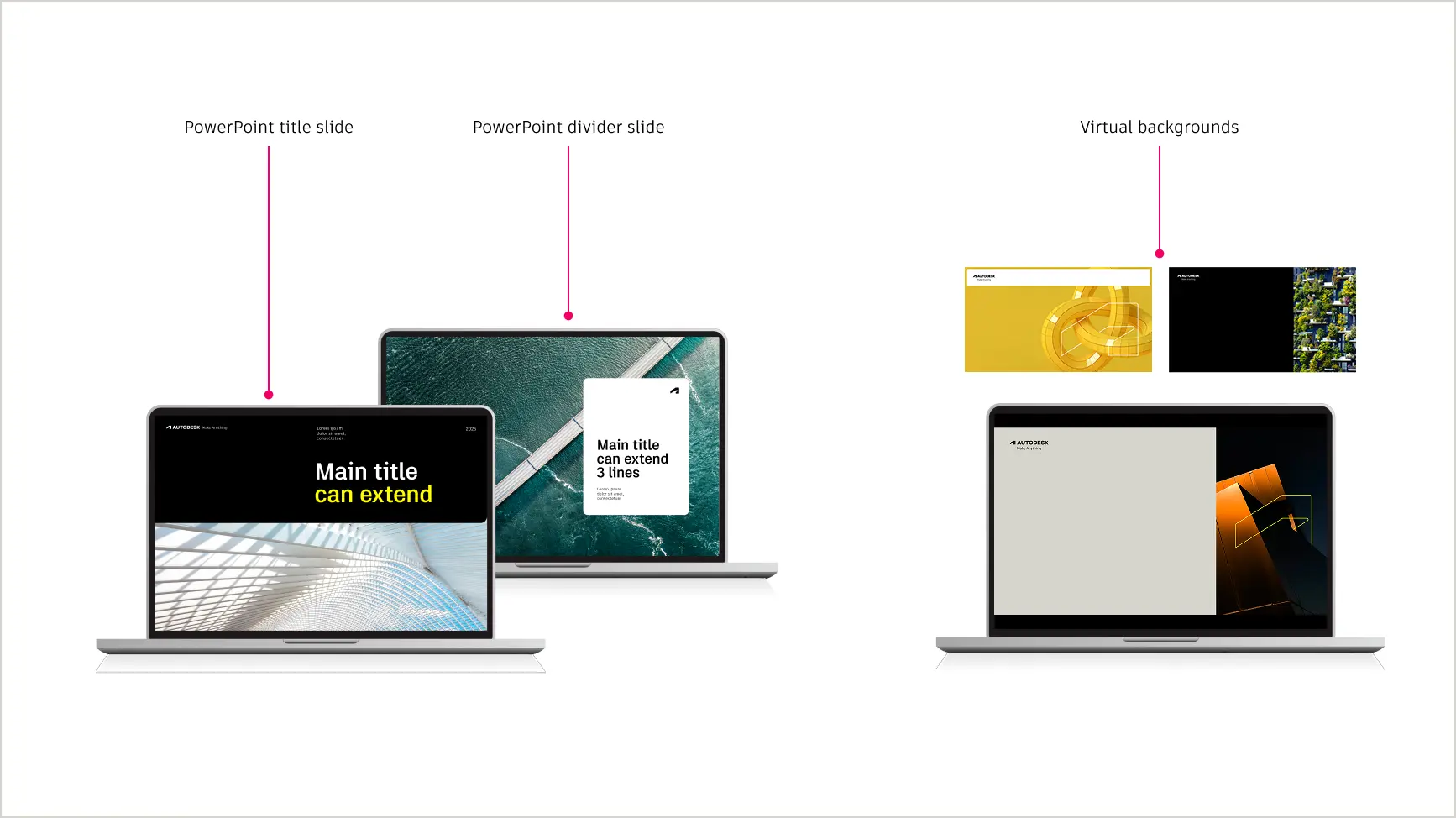
Digital/virtual event assets Copy link to clipboard
Thoughtfully branded digital experiences can make a user’s journey easier, more meaningful, and more clearly an Autodesk one. Well-executed digital assets can create a heightened sense of community and connection with Autodesk and other attendees in a remote context.
Fixed and flexible design elements Copy link to clipboard
Our brand design system uses fixed and flexible elements to allow for all Autodesk events to look and feel like they’re from the same company, with room for individual events to be personalized to the needs of their audience. Fixed elements must always be present while flexible elements are open to creativity and tailoring to each event.
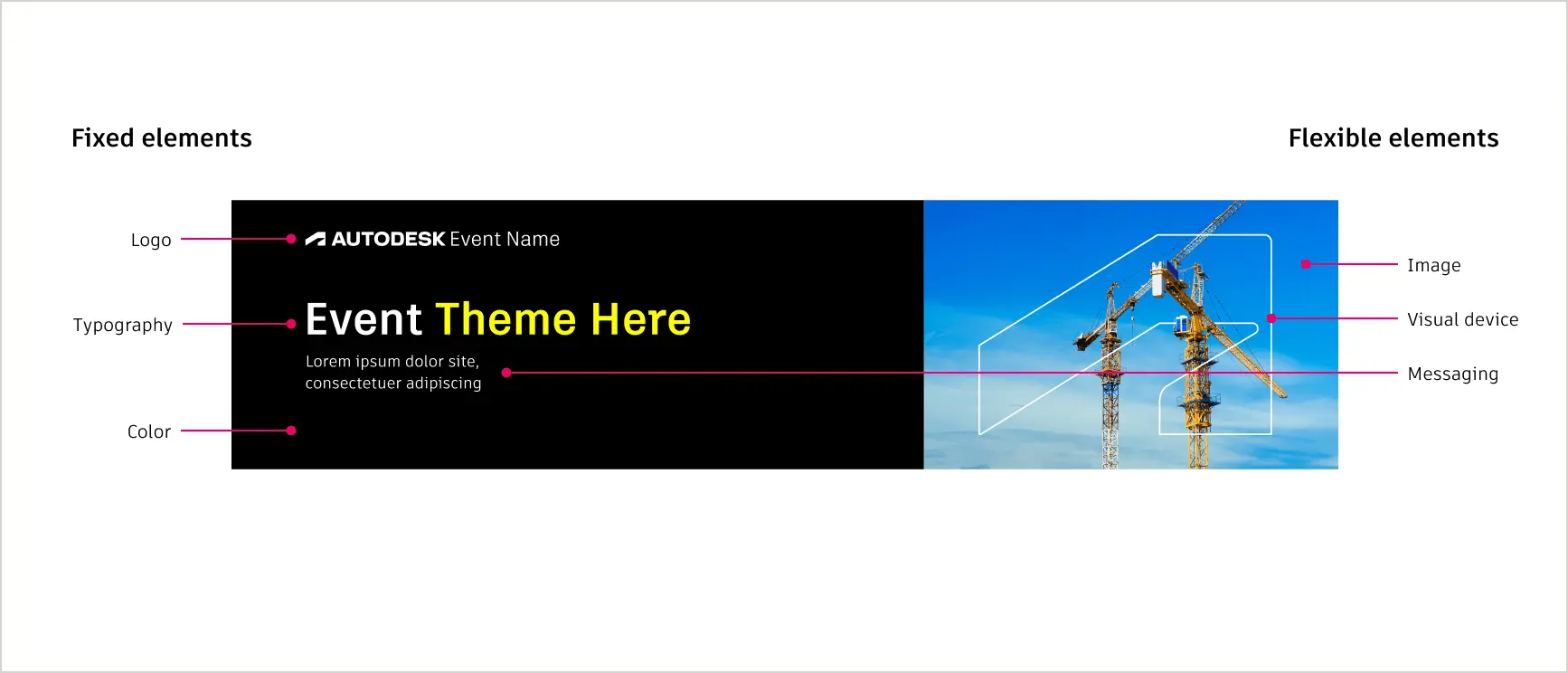
Fixed elements
These elements must always be present and treated consistently. Visit the brand system section for detailed information.
- Autodesk logo
- Colors
- Typography
- Our grid-based layout system
- Treatment of event theme or name and lockups. Be sure to follow our event logo guidance.
Flexible elements
These elements are versatile and can be adapted to meet the needs of different events or audiences.
- Choice of theme and messaging. Consider our brand voice system when developing verbal elements.
- Use of our visual devices, the window and the thread
- Choice of imagery
- Use and proportion of primary brand colors
- Layouts within our grid-based layout system
- Environmental features like furniture, greenery, and music, especially for in-person events (see more below).
Event creative checklist Copy link to clipboard
DOs
- DO use our layout grid, the window, and the thread thoughtfully to emphasize our brand and help tell visual stories.
- DO prioritize Autodesk Black, Autodesk White, and Hello Yellow as the foundation of your color palette, even with images.
- DO use quality images and be sure printed images are of high enough resolution to not be blurry or pixelated.
- DO consider the space and sight lines of the environment to ensure key information is at eye level to aid visibility and legibility.
- DO ensure text is accessible and easily legible. Allow generous space for content and text.
- DO always ensure the symbol and/or full logo are consistently and appropriately positioned in layouts.
- DO follow all voice system and visual brand system guidelines.
- DO consider how the theme plays out across the attendee journey, from the first touchpoint to the on-site experience and everything in between.
DO NOTs
- DO NOT repeat the same grid layout everywhere.
- DO NOT make graphics all Autodesk Black or all Autodesk White.
- DO NOT use inferior quality imagery, or imagery that does not follow photography guidelines.
- DO NOT feature the Autodesk logo or event logo at foot level.
- DO NOT crop images in ways that make the subject matter unrecognizable, especially at small sizes.
- DO NOT crowd layouts or clutter graphics with too many elements or too much text.
- DO NOT place key information in places where it is, or could be, obscured or someplace awkward, like near the floor.
Creating immersive Autodesk experiences Copy link to clipboard
Because events present opportunities for immersion and spontaneity, all parts of the event experience should be intentional and help to reinforce positive associations with the Autodesk brand.
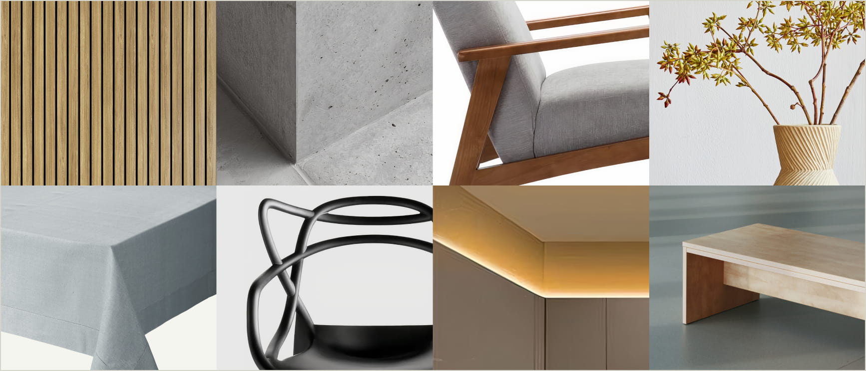
Furniture: Furniture or booth components sourced for an event should work together to convey beauty, quality, and promote our point-of-view as the leading design and make company. Be consistent with color and materials and choose the most sustainable options whenever possible.
Greenery and foliage: Things like greenery and foliage can help enliven a space and promote relaxation. Choose greenery over floral arrangements and always opt for real rather than artificial plants to add warmth and life to your environment whenever possible. Design-forward, striking examples can elevate the experience and create a connection with how our work also benefits the natural world.
Lighting: When making lighting choices, consider the space, the mood you’re trying to create, and how to guide people’s vision. Is the goal to focus attention on a speaker or create a welcoming entrance? Does signage need brighter lighting for visibility and legibility, or is a casual networking atmosphere more appropriate? In general, avoid overly harsh light for social spaces and too dim of light for informational settings.
Music/Audio: When possible, put thought into the music and sound experience to make the event more thoroughly Autodesk. Think of music as an extension to our verbal identity. What emotion are you trying to convey? Do you want to generate excitement for a speaker walking on stage or create loungy ambiance to facilitate networking? As a general rule of thumb, avoid music that is overly dissonant, vulgar, or distracting for attendees. Keep it optimistic, melodic, inclusive, and professional.
In general, always create event experiences that are premium, sophisticated, mindful, and lead into the future. Taken together, every event experience should offer a comprehensive connection and experience with Autodesk and what we stand for.