Our logo is made up of an abstract “A” symbol paired with our company name as a wordmark in Artifakt. The symbol uses understated design elements to create a sense of moving forward and upward with subtle three-dimensionality to evoke progress, improvement, and growth. It all ties back to our brand promise: With Autodesk, our customers can design and make a better world. Our logo is the heart of our visual identity and should be used often but consistently.
Logo variations Copy link to clipboard
Primary logo
The primary logo is the core element of the Autodesk identity. It is designed to be distinctive, scalable, and recognizable in large and small sizes for accessibility. It should appear frequently and be applied consistently on external communications. It is custom drawn and should never be recreated with typesetting or altered.
Download the primary logo (access required).
Alternate stacked logo
The alternate stacked logo should only be used in instances when the primary logo doesn’t fit well within the space.
Download the alternate logo (access required).
The symbol
In some special cases, the symbol can be used on its own. These include applications requiring a logo that is smaller than the minimum size for the primary or alternative stacked logo, and in certain instances where it is in a context where the Autodesk brand has already been firmly established.
Scale Copy link to clipboard
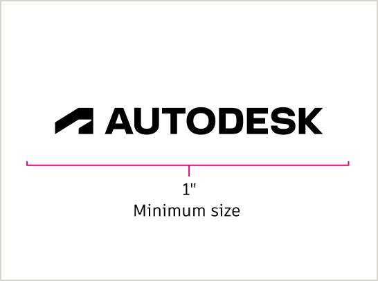
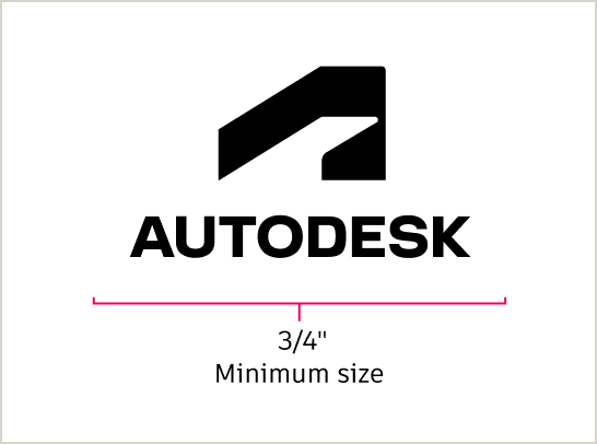
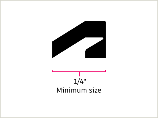
To preserve legibility, the Autodesk primary logo should not be scaled smaller than 1 inch wide, the Autodesk alternate stacked logo should not be scaled smaller than 3/4 inch wide, and the Autodesk symbol should not be scaled smaller than 1/4 inch wide.
Clear space Copy link to clipboard
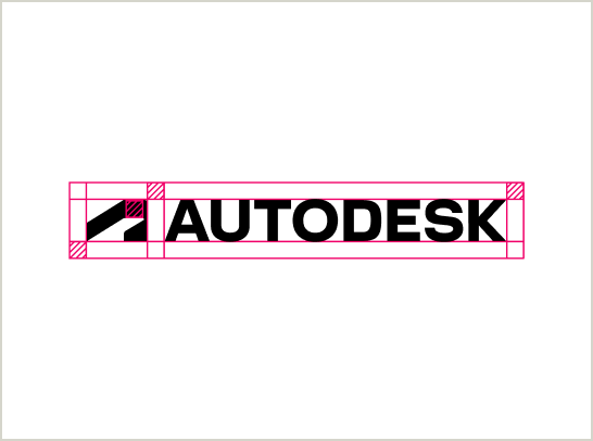
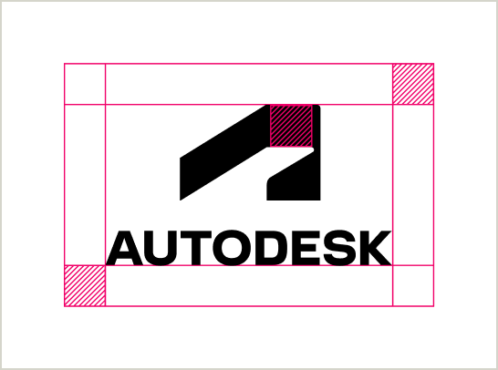
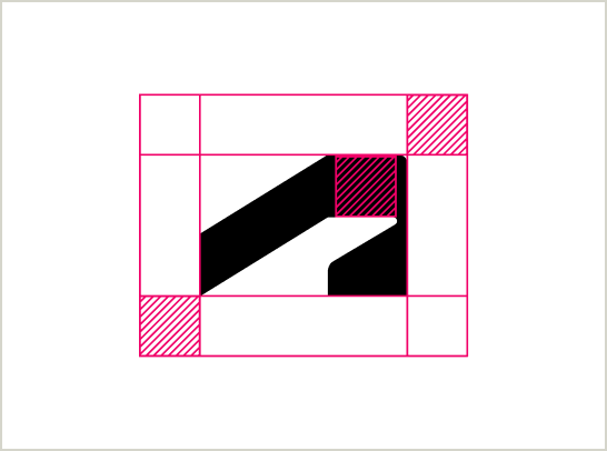
Always include sufficient breathing space around uses of the full Autodesk logo (symbol and wordmark together) or the symbol on its own to ensure they don’t compete for attention with other visuals.
Use the height of the crossbar at the top of the abstract “A” symbol (see below) as a guide to ensure every use of the logo or symbol has enough breathing space.
Placement Copy link to clipboard
The Autodesk logo or symbol must be placed prominently and intuitively in any application in which it appears. Always be sure the logo or symbol appears with a high enough contrast to its background that its edges are clearly defined and the wordmark is legible. Refer to the color contrast chart on the Color page for more details.
Follow these placement guidelines for the primary logo and the alternative stacked logo.
Primary
The primary logo can be placed top left or right, bottom left or right, or centered at the top, middle, or bottom of your layout.
Alternate stacked
The alternate stacked logo can be placed in the center of the layout at the top, middle, or bottom.
Logo color Copy link to clipboard
Our logo can only be used in Autodesk Black or Autodesk White. Autodesk Black is preferred. Autodesk White is acceptable against sufficiently dark backgrounds.
The Autodesk logo should never be Hello Yellow. For legibility and accessibility, an Autodesk White logo should never be used on a Hello Yellow background.
Autodesk Black logo
Use the Autodesk Black logo on light backgrounds.
Autodesk White logo
Use the Autodesk White logo on sufficiently dark backgrounds.
Logo use checklist Copy link to clipboard
Never alter the parent logo in any way.
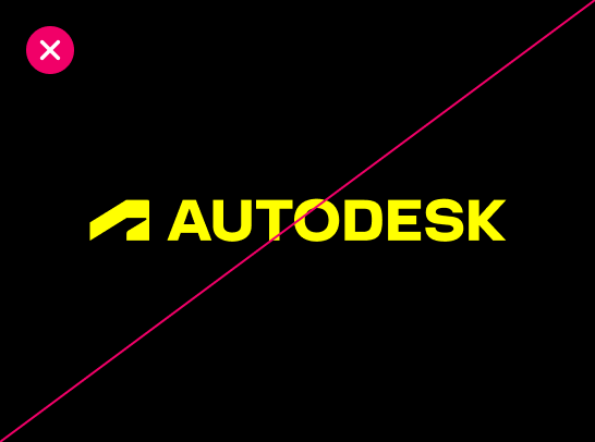
DO NOT use a Hello Yellow logo on Autodesk Black. The logo should always be Autodesk Black or Autodesk White.
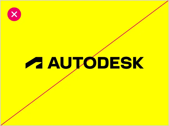
DO NOT place the logo or symbol on Hello Yellow. Autodesk’s parent brand identity is black and white.
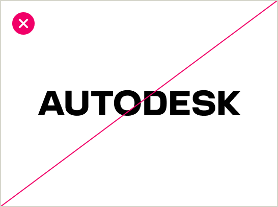
DO NOT use the wordmark by itself.
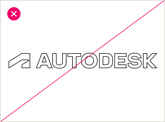
DO NOT use the logo as an outline.
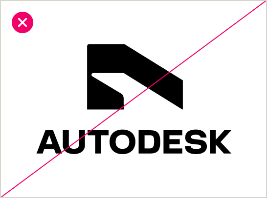
DO NOT flip the orientation of the symbol.
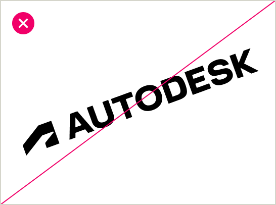
DO NOT place the logo at an angle.
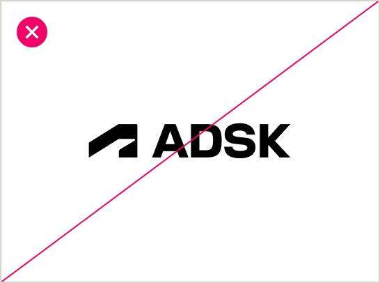
DO NOT create an acronym using the characters from the wordmark.
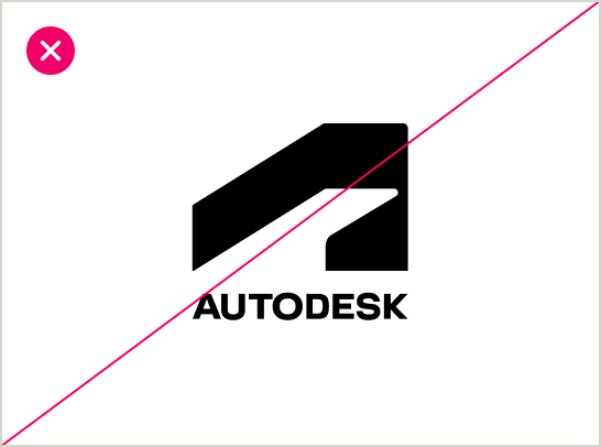
DO NOT change the size of the symbol on any logo variation.
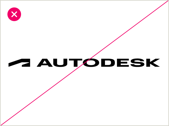
DO NOT graphically alter the logo.
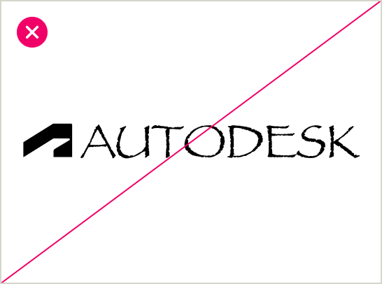
DO NOT type out the wordmark.
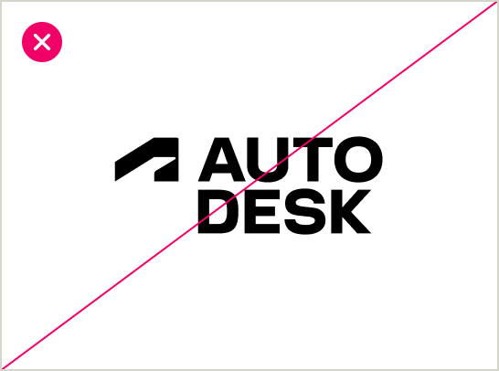
DO NOT break up the wordmark.
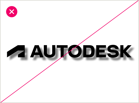
DO NOT apply a drop shadow to the logo.
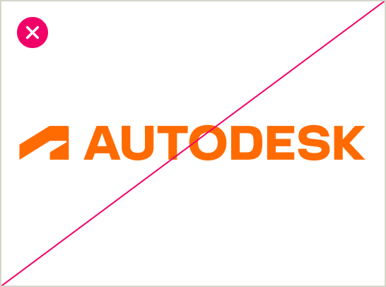
DO NOT apply color not approved by Brand.
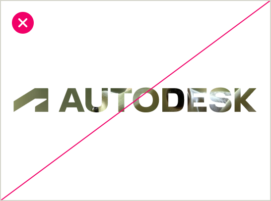
DO NOT knock out images into the logo.
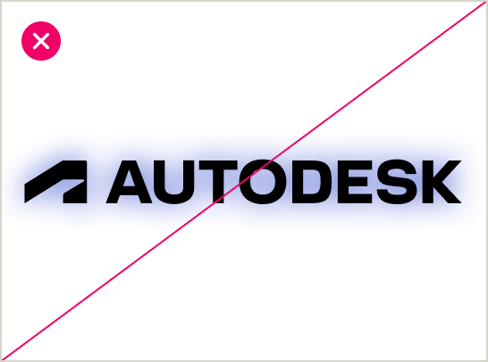
DO NOT apply a glow effect to the logo.
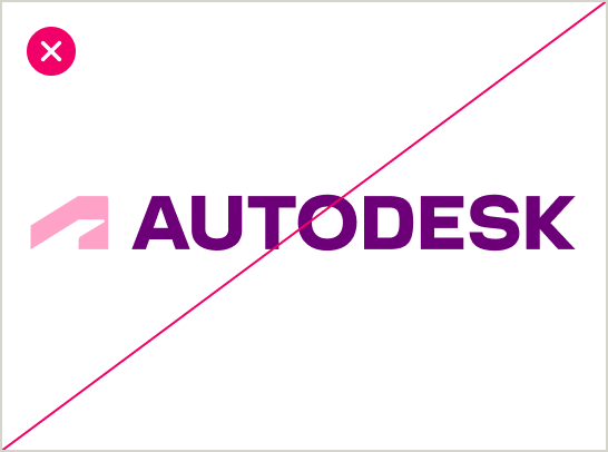
DO NOT use in multiple colors.
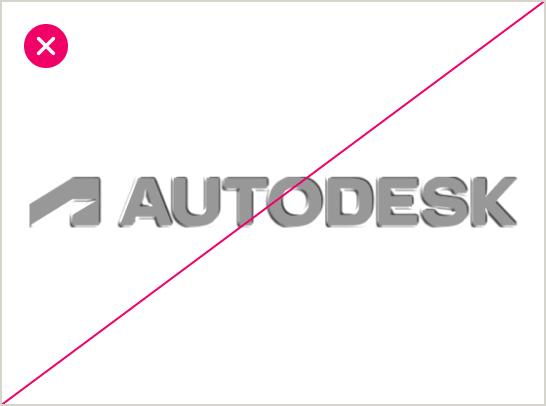
DO NOT apply bevel or emboss effects to the logo.
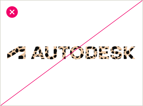
DO NOT apply patterns or textures on the logo.
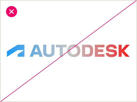
DO NOT apply gradients on the logo.
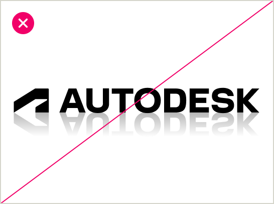
DO NOT add reflections to the logo.