Our colors help us stand out in our industry and instantly establish a connection with our audience. Autodesk Black and Autodesk White communicate confidence and sophistication, while Hello Yellow is an ownable, unignorable statement that sets us apart and signals our creative, forward-thinking values. Our colors have also been carefully selected to be inclusive and viewable by the widest audience possible. Using them intentionally and consistently results in an experience that grabs attention while building familiarity and trust.
Our primary colors, Autodesk Black, Autodesk White, and Hello Yellow, should always lead to establish the parent brand. Our secondary colors—Warm Slate and Slate—and our tertiary colors—Dawn, Dusk, Twilight, and Morning—round out the system.
By adhering to the defined color values, including for tints and shades, your work will be more inclusive, perform better, and be compliant with accessibility best practices and legal requirements.
Primary brand colors Copy link to clipboard
The primary brand colors of Autodesk are Autodesk Black, Autodesk White, and Hello Yellow. Autodesk Black and Autodesk White represent a company with confidence and self-assurance. Hello Yellow makes us unignorable, creating an instant visual connection.
As a rule, aside from visuals like photographs or instances outlined below for our secondary and tertiary colors, all Autodesk assets should be in Autodesk Black and Autodesk White, with Hello Yellow used as a highlight or reveal to create unique and special experiences.
Autodesk Black and Autodesk White should always be used as is. You may use tints of Hello Yellow, as long as the pure primary Hello Yellow is the predominant shade.

Autodesk Black
Hex: #000000
RGB: (0, 0, 0)
CMYK: (60, 40, 40, 100)
Pantone: Black C

Autodesk White
Hex: #FFFFFF
RGB: (255, 255, 255)
CMYK: (0, 0, 0, 0)

Hello Yellow
Hex: #FFFF00
RGB: (255, 255, 0)
CMYK: (0, 0, 100, 0)
Pantone: 3935 C
Secondary colors Copy link to clipboard
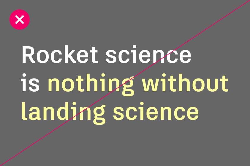
For most campaign or event assets, our three primary colors should be sufficient. Our secondary colors, Warm Slate and Slate, can help create subtle but important visual distinction when information is complex or needs hierarchy, such as in brochures, white papers, charts and graphs, or web pages.
If size contrast isn’t enough to establish text hierarchy or values in a chart need differentiation or gradation, use Warm Slate or Slate.

Warm Slate
Hex: #D5D5CB
RGB: (213, 213, 203)
CMYK: (16, 11, 18, 0)
Pantone: 400 C

Slate
Hex: #666666
RGB: (102, 102, 102)
CMYK: (60, 51, 51, 20)
Pantone: Cool Grey 10 C
Tertiary colors Copy link to clipboard
Tertiary colors should serve functional purposes, not aesthetic ones. Use only the primary brand colors and secondary colors when necessary, unless a clear, functional need requires an additional color.
Use our tertiary colors to indicate status, emphasis, or the need for action when Autodesk Black, Autodesk White, Hello Yellow, Warm Slate, or Slate can’t. In some contexts, like presentations, tertiary colors can highlight key points, features, functions, or actions.
Take care that tertiary colors never compete with primary brand colors or appear to be a primary brand color.

Dawn
Hex: #F09D4F
RGB: (240, 157, 79)
CMYK: (4, 44, 78, 0)
Pantone: 714 C

Dusk
Hex: #F2520A
RGB: (242, 82, 10)
CMYK: (0, 82, 100, 0)
Pantone: 1655 C

Twilight
Hex: #1D91D0
RGB: (29, 145, 208)
CMYK: (77, 31, 0, 0)
Pantone: 2382 C

Morning
Hex: #2AD0A9
RGB: (42, 208, 169)
CMYK: (66, 0, 47, 0)
Pantone: 7465 C
Color proportions and usage Copy link to clipboard
Using the appropriate balance of primary, secondary, and tertiary brand colors maintains a cohesive brand identity that aligns with accessibility and usability standards.
Our color proportion guidelines are designed to help you determine the appropriate distribution of colors in any composition. This framework prioritizes the use of the primary brand colors (Autodesk Black, Autodesk White, and Hello Yellow) as the foundation, with secondary colors available for hierarchy or gradations and tertiary colors providing functional cues where needed. This approach not only enhances readability but also ensures designs are visually engaging without being overwhelming.
These proportions apply to graphic elements like text, shapes, charts, and visual materials, excluding images like photography or illustrations. These guidelines protect our visual consistency across all touchpoints.
Color proportions breakdown Copy link to clipboard
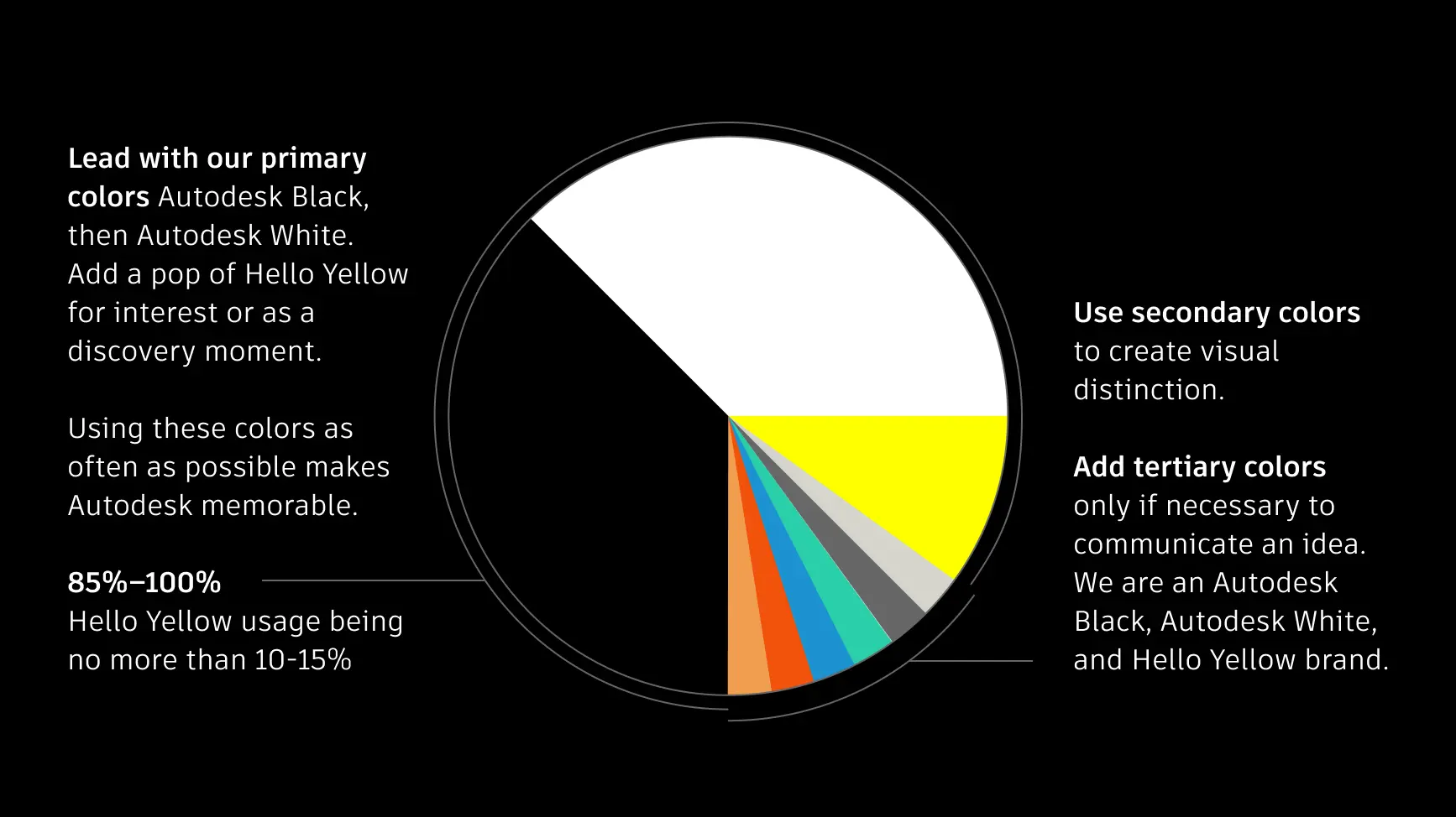
The color proportion wheel demonstrates how to allocate colors in visual materials.
Primary
Lead with Autodesk Black as the dominant background or text color. Use Autodesk White as a secondary color for contrast or white space or when placed against a sufficiently dark background.
Secondary
Use secondary colors sparingly. Warm Slate and Slate should function as supportive elements to express hierarchy or gradations rather than focal points.
Tertiary
Tertiary colors should be used sparingly for functional purposes, like prompting the viewer to take an action or highlighting a detail. Use rarely and purposefully.
Primary brand color use checklist Copy link to clipboard
The primary colors—Autodesk Black, Hello Yellow, and Autodesk White—are the heart of the Autodesk brand. Autodesk Black and Autodesk White should dominate most designs, with Hello Yellow used as a special pop to add energy and visibility.

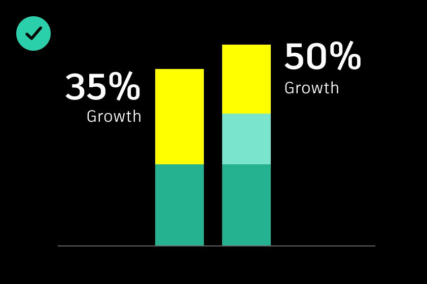
DO prioritize Autodesk Black, Autodesk White, and Hello Yellow as the basis for design layouts. For guidance on using Hello Yellow, refer to Colors, Visual devices, and Typography on the Brand Hub.
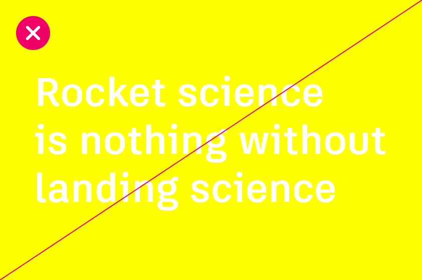
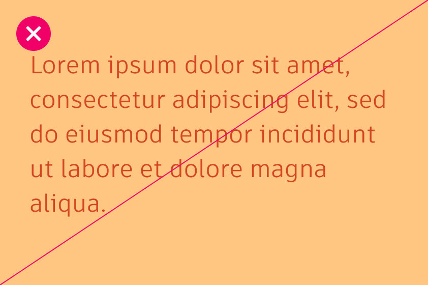
DO NOT pair Hello Yellow directly with Autodesk White. The combination is too low contrast, rendering it illegible and inaccessible.
DO NOT use unapproved tints or shades of Autodesk colors.

DO use a combination of Autodesk Black, Autodesk White, and Hello Yellow for most assets, except for images and photography.
Using secondary colors Copy link to clipboard
Our secondary colors, Warm Slate and Slate, provide a subtle and neutral palette to define elements without overwhelming the design. While the primary brand colors (Autodesk Black, Autodesk White, and Hello Yellow) should dominate, secondary colors offer a way to introduce hierarchy, separation, or emphasis when additional visual distinctions are needed. They are especially valuable for web and digital interfaces to enhance usability and clarity.
Using tertiary colors Copy link to clipboard
Tertiary colors serve a functional role rather than a decorative one. They are intended to draw attention to specific elements, such as status indicators or key highlights, where primary colors (Autodesk Black, Autodesk White, and Hello Yellow) and secondary colors are insufficient. The use of tertiary colors should be deliberate and restrained to maintain balance and avoid overpowering the design.
Tertiary color use checklist
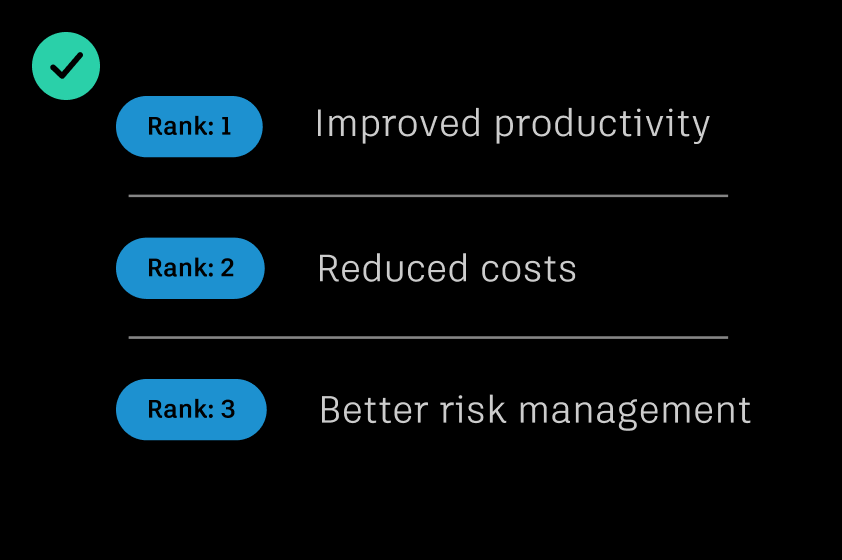
DO use tertiary colors when necessary to highlight key points, features, functions, or actions.
DO use a single tertiary color and its tints or shades with brand colors to maintain clarity and ensure alignment with the brand’s visual hierarchy.

DO NOT use more than three tertiary colors or their tints or shades per visual. Maintain a minimal palette to elevate the aesthetic and make color more effective.
DO NOT use tertiary colors for type without checking the contrast level.

DO NOT use a tertiary color in a way that makes it appear as a primary brand color or competes with one.
Accessibility Copy link to clipboard
Our assets should be accessible to all, and color plays a key role. When designing any customer touchpoint, including digital assets, graphics in videos, social content, data visualization charts, user interfaces, and more, consider the accessibility of the colors you choose.
If colors aren’t sufficiently distinct from one another, it can create unnecessary difficulty for anyone viewing letters and visual elements in our designs, especially low-vision users. This includes brightness, hue, light and dark, and more.
Color contrast ratios Copy link to clipboard
Contrast is the difference in brightness between any two elements. The Web Content Accessibility Guidelines (WCAG) set specific ratios that achieve the minimum required contrast for legibility. Generally speaking, small text is any size below 24px and requires a 4.5:1 contrast ratio. Large text is anything above 24px and requires a 3:1 contrast ratio. Graphical elements, such as charts in data visualizations, also require a 3:1 contrast ratio.
To assess contrast, it’s helpful to measure the “distance” between two colors in terms of brightness or tonal difference. In this context, the difference between colors can be thought of as steps along a scale of tints and shades. For example, a mid-tone value (e.g., Twilight 400) may be three steps away from a lighter shade (Twilight 100). The following guidelines specify the minimum step differences needed to meet common contrast ratios across various use cases.
Accessibility compliance markers
| Key | |
|---|---|
 Small text = Less than 24px (ratio ≥ 4.50) Small text = Less than 24px (ratio ≥ 4.50) |  Row passes WCAG 2.1 Level AA requirement Row passes WCAG 2.1 Level AA requirement |
 Large text = At least 24px (19px if bold) (ratio ≥ 3.00) Large text = At least 24px (19px if bold) (ratio ≥ 3.00) |  Row fails WCAG 2.1 Level AA requirement Row fails WCAG 2.1 Level AA requirement |
 Graphical objects and UI components (ratio ≥ 3.00) Graphical objects and UI components (ratio ≥ 3.00) |  Row contains some configurations that do not pass WCAG 2.1 Level AA requirement Row contains some configurations that do not pass WCAG 2.1 Level AA requirement |
 Fails WCAG 2.1 Level AA requirement Fails WCAG 2.1 Level AA requirement |
Autodesk Black
- HEX: #000000
- RGB: (0, 0, 0)
- CMYK: (60, 40, 40, 100)
- Pantone: Black C
Autodesk White with Autodesk Black is ok for text or interactive components with a contrast of 21
Autodesk Black with #000000 is not ok for text or interactive components with a contrast of 1
Autodesk White
- HEX: #ffffff
- RGB: (255, 255, 255)
- CMYK: (0, 0, 0, 0)
Autodesk White with Autodesk White is not ok for text or interactive components with a contrast of 1
Autodesk Black with #ffffff is ok for text or interactive components with a contrast of 21
Hello Yellow
- HEX: #ffff00
- RGB: (255, 255, 0)
- CMYK: (0, 0, 100, 0)
- Pantone: 3935 C
Autodesk White with Hello Yellow is not ok for text or interactive components with a contrast of 1.07
Autodesk Black with #ffff00 is ok for text or interactive components with a contrast of 19.55
- HEX: #d7cb1d
- RGB: (215, 203, 29)
- CMYK: (20, 10, 100, 0)
- Pantone: 7765 C
Autodesk White with Hello Yellow 700 is not ok for text or interactive components with a contrast of 1.68
Autodesk Black with #d7cb1d is ok for text or interactive components with a contrast of 12.44
- HEX: #eee410
- RGB: (238, 228, 16)
- CMYK: (10, 2, 100, 0)
- Pantone: 4232 C
Autodesk White with Hello Yellow 600 is not ok for text or interactive components with a contrast of 1.33
Autodesk Black with #eee410 is ok for text or interactive components with a contrast of 15.74
- HEX: #fdfda1
- RGB: (253, 253, 161)
- CMYK: (0, 0, 43, 0)
- Pantone: 587 C
Autodesk White with Hello Yellow 200 is not ok for text or interactive components with a contrast of 1.06
Autodesk Black with #fdfda1 is ok for text or interactive components with a contrast of 19.74
Warm Slate
- HEX: #d5d5cb
- RGB: (213, 213, 203)
- CMYK: (16, 11, 18, 0)
- Pantone: 400 C
Autodesk White with Warm Slate is not ok for text or interactive components with a contrast of 1.47
Autodesk Black with #d5d5cb is ok for text or interactive components with a contrast of 14.2
- HEX: #e4e4db
- RGB: (228, 228, 219)
- CMYK: (10, 7, 12, 0)
- Pantone: Warm Grey 1 C
Autodesk White with Warm Slate 300 is not ok for text or interactive components with a contrast of 1.27
Autodesk Black with #e4e4db is ok for text or interactive components with a contrast of 16.41
- HEX: #f5f5f0
- RGB: (245, 245, 240)
- CMYK: (2, 2, 4, 0)
- Pantone: 9081 C
Autodesk White with Warm Slate 100 is not ok for text or interactive components with a contrast of 1.09
Autodesk Black with #f5f5f0 is ok for text or interactive components with a contrast of 19.2
Slate
- HEX: #666666
- RGB: (102, 102, 102)
- CMYK: (60, 51, 51, 20)
- Pantone: Cool Grey 10 C
Autodesk White with Slate is ok for text or interactive components with a contrast of 5.74
Autodesk Black with #666666 is only ok for large text and interactive components with a contrast of 3.65
- HEX: #858585
- RGB: (133, 133, 133)
- CMYK: (50, 42, 42, 6)
- Pantone: Cool Grey 9 C
Autodesk White with Slate 400 is only ok for large text and interactive components with a contrast of 3.69
Autodesk Black with #858585 is ok for text or interactive components with a contrast of 5.69
- HEX: #a3a3a3
- RGB: (163, 163, 163)
- CMYK: (38, 31, 31, 0)
- Pantone: Cool Grey 7 C
Autodesk White with Slate 300 is not ok for text or interactive components with a contrast of 2.52
Autodesk Black with #a3a3a3 is ok for text or interactive components with a contrast of 8.32
- HEX: #c9c9c9
- RGB: (201, 201, 201)
- CMYK: (21, 16, 16, 0)
- Pantone: Cool Grey 7 C
Autodesk White with Slate 200 is not ok for text or interactive components with a contrast of 1.65
Autodesk Black with #c9c9c9 is ok for text or interactive components with a contrast of 12.68
- HEX: #e8e8e8
- RGB: (232, 232, 232)
- CMYK: (7, 6, 6, 0)
- Pantone: 427 C
Autodesk White with Slate 100 is not ok for text or interactive components with a contrast of 1.22
Autodesk Black with #e8e8e8 is ok for text or interactive components with a contrast of 17.13
Dawn
- HEX: #f09d4f
- RGB: (240, 157, 79)
- CMYK: (4, 44, 78, 0)
- Pantone: 714C
Autodesk White with Dawn is not ok for text or interactive components with a contrast of 2.17
Autodesk Black with #f09d4f is ok for text or interactive components with a contrast of 9.64
- HEX: #cd7523
- RGB: (205, 117, 35)
- CMYK: (16, 62, 100, 3)
- Pantone: 7565 C
Autodesk White with Dawn 700 is only ok for large text and interactive components with a contrast of 3.4
Autodesk Black with #cd7523 is ok for text or interactive components with a contrast of 6.16
- HEX: #e68d3a
- RGB: (230, 141, 58)
- CMYK: (7, 53, 90, 0)
- Pantone: 7413 C
Autodesk White with Dawn 600 is not ok for text or interactive components with a contrast of 2.54
Autodesk Black with #e68d3a is ok for text or interactive components with a contrast of 8.23
- HEX: #fec681
- RGB: (254, 198, 129)
- CMYK: (0 ,24, 55, 0)
- Pantone: 156 C
Autodesk White with Dawn 300 is not ok for text or interactive components with a contrast of 1.54
Autodesk Black with #fec681 is ok for text or interactive components with a contrast of 13.6
- HEX: #ffe9c5
- RGB: (255, 233, 197)
- CMYK: (0, 8, 24, 0)
- Pantone: 7506 C
Autodesk White with Dawn 100 is not ok for text or interactive components with a contrast of 1.18
Autodesk Black with #ffe9c5 is ok for text or interactive components with a contrast of 17.71
Dusk
- HEX: #f2520a
- RGB: (242, 82, 10)
- CMYK: (0, 82, 100, 0)
- Pantone: 1655 C
Autodesk White with Dusk is only ok for large text and interactive components with a contrast of 3.5
Autodesk Black with #f2520a is ok for text or interactive components with a contrast of 5.98
- HEX: #d34621
- RGB: (211, 70, 33)
- CMYK: (15, 87, 100, 0)
- Pantone: 7597 C
Autodesk White with Dusk 700 is only ok for large text and interactive components with a contrast of 4.49
Autodesk Black with #d34621 is ok for text or interactive components with a contrast of 4.66
- HEX: #de4f0d
- RGB: (222, 79, 13)
- CMYK: (9, 83, 100, 0)
- Pantone: 1665 C
Autodesk White with Dusk 600 is only ok for large text and interactive components with a contrast of 4.01
Autodesk Black with #de4f0d is ok for text or interactive components with a contrast of 5.23
- HEX: #ff9667
- RGB: (255, 150, 103)
- CMYK: (0, 51, 62, 0)
- Pantone: 163 C
Autodesk White with Dusk 300 is not ok for text or interactive components with a contrast of 2.14
Autodesk Black with #ff9667 is ok for text or interactive components with a contrast of 9.81
- HEX: #ffddcd
- RGB: (255, 221, 205)
- CMYK: (0, 15, 16, 0)
- Pantone: 9241 C
Autodesk White with Dusk 100 is not ok for text or interactive components with a contrast of 1.27
Autodesk Black with #ffddcd is ok for text or interactive components with a contrast of 16.47
Twilight
- HEX: #1d91d0
- RGB: (29, 145, 208)
- CMYK: (77, 31, 0, 0)
- Pantone: 2382 C
Autodesk White with Twilight is only ok for large text and interactive components with a contrast of 3.49
Autodesk Black with #1d91d0 is ok for text or interactive components with a contrast of 6.01
- HEX: #136b9a
- RGB: (19, 107, 154)
- CMYK: (92, 58, 20, 0)
- Pantone: 7469 C
Autodesk White with Twilight 700 is ok for text or interactive components with a contrast of 5.83
Autodesk Black with #136b9a is only ok for large text and interactive components with a contrast of 3.59
- HEX: #1278af
- RGB: (18, 120, 175)
- CMYK: (86, 47, 10, 10)
- Pantone: 2152 C
Autodesk White with Twilight 600 is ok for text or interactive components with a contrast of 4.84
Autodesk Black with #1278af is only ok for large text and interactive components with a contrast of 4.33
- HEX: #4eb3e9
- RGB: (78, 179, 233)
- CMYK: (62, 13, 0, 0)
- Pantone: 298 C
Autodesk White with Twilight 300 is not ok for text or interactive components with a contrast of 2.34
Autodesk Black with #4eb3e9 is ok for text or interactive components with a contrast of 8.94
- HEX: #bfe4f7
- RGB: (191, 228, 247)
- CMYK: (24, 0, 0, 0)
- Pantone: 545 C
Autodesk White with Twilight 100 is not ok for text or interactive components with a contrast of 1.34
Autodesk Black with #bfe4f7 is ok for text or interactive components with a contrast of 15.65
Morning
- HEX: #2ad0a9
- RGB: (42, 208, 169)
- CMYK: (66, 0, 47, 0)
- Pantone: 7465 C
Autodesk White with Morning is not ok for text or interactive components with a contrast of 1.96
Autodesk Black with #2ad0a9 is ok for text or interactive components with a contrast of 10.69
- HEX: #21a183
- RGB: (33, 161, 131)
- CMYK: (80,13, 60, 0)
- Pantone: 7473 C
Autodesk White with Morning 700 is only ok for large text and interactive components with a contrast of 3.23
Autodesk Black with #21a183 is ok for text or interactive components with a contrast of 6.49
- HEX: #24b291
- RGB: (36, 178, 145)
- CMYK: (75, 4, 56, 0)
- Pantone: 3268 C
Autodesk White with Morning 600 is not ok for text or interactive components with a contrast of 2.67
Autodesk Black with #24b291 is ok for text or interactive components with a contrast of 7.85
- HEX: #7be4cc
- RGB: (123, 228, 204)
- CMYK: (42,0, 26, 0)
- Pantone: 337 C
Autodesk White with Morning 300 is not ok for text or interactive components with a contrast of 1.52
Autodesk Black with #7be4cc is ok for text or interactive components with a contrast of 13.81
- HEX: #d5f6ee
- RGB: (213, 246, 238)
- CMYK: (13, 0, 7, 0)
- Pantone: 9044 C
Autodesk White with Morning 100 is not ok for text or interactive components with a contrast of 1.15
Autodesk Black with #d5f6ee is ok for text or interactive components with a contrast of 18.24
Tints and shades Copy link to clipboard
Thoughtful and sparing use of tints and shades can add depth, hierarchy, and subtle variations to designs. DO NOT use tints or shades of Autodesk Black or Autodesk White. You may use tints of Hello Yellow, as long as the pure primary Hello Yellow is the predominant shade.
Tints (lighter variations of a color) create a sense of softness and balance while shades (darker variations) provide contrast and emphasis. Together, they help ensure designs are visually engaging, easy to navigate, and consistent with brand identity.
Using tints and shades strategically allows you to highlight important elements, define sections, and guide user attention without overwhelming the design. When applied thoughtfully, they enhance usability and accessibility while maintaining a cohesive visual language.
Tints (lighter variations)
Tints, or lighter variations of secondary and tertiary colors, add lightness and sophistication to designs. They are particularly effective for indicating lower intensities or values in charts or for creating subtle contrast in layouts.
Shades (darker variations)
Shades, or darker variations of secondary and tertiary colors, provide contrast and depth. They can emphasize greater intensities or values in charts or create stronger visual separation in layouts.
Color values
When to use tints and shades Copy link to clipboard
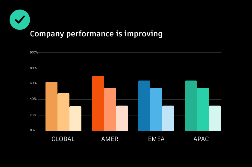
Data visualizations and charts
Tints and shades allow you to communicate subtle variations in large data sets and complex charts.
Background containers
Using tints of Warm Slate and Slate as background container elements allows for subtle distinction between sections.
Tints and shades checklist Copy link to clipboard
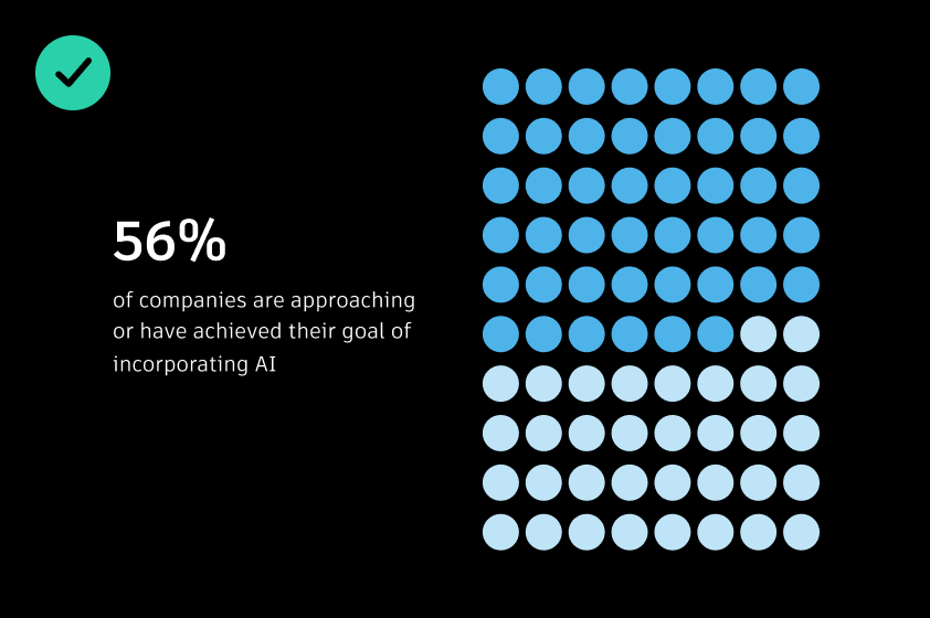
DO use a single tint and shade family in data visualizations or layout where possible to ensure a simple aesthetic.
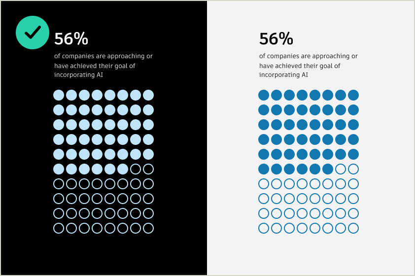
DO use tints for dark backgrounds, and dark shades for light backgrounds.
DO only use multiple color tint families where needed to further emphasize data. Ensure that the same tint family is used within a set of data or shape; don’t mix and match.
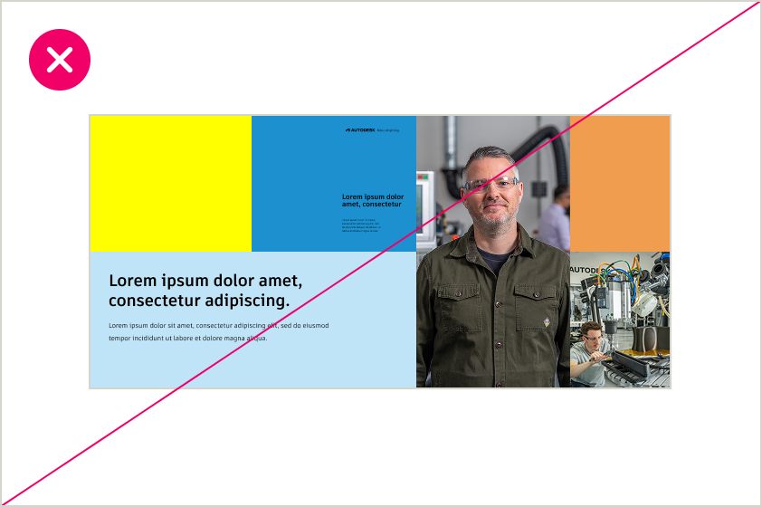
DO NOT mix multiple color themes in a single layout when using tints and shades for color blocking. This creates visual inconsistency and dilutes the impact of the design. Stick to the primary brand colors and shades.
DO NOT use colors that are too close together in value within a visualization or against a gray background.
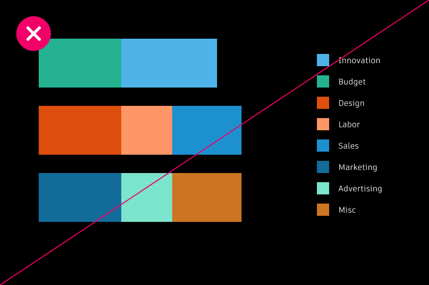
DO NOT mix and match tints and shades. Combining too many tints or shades in one composition can reduce visual clarity. Stick to one color grouping where possible.