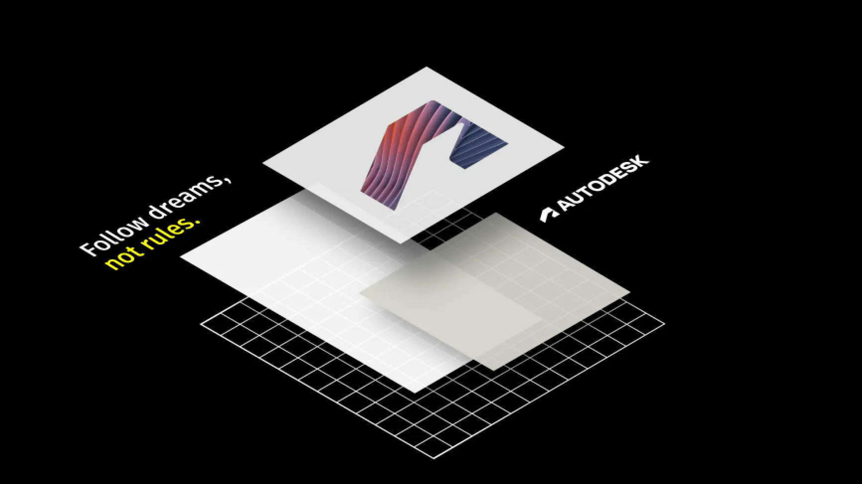
The brand layout system sets the stage for how we communicate visually—through a flexible grid system and intentional use of color blocking. These elements ensure every design feels cohesive and unmistakably Autodesk, no matter the medium.
Our grid system provides structure and scalability, adapting seamlessly to various formats, while the strategic use of Autodesk colors delivers a bold and recognizable identity. Together, these tools empower teams to create a system of grids and designs that are both consistent and dynamic, bringing clarity to complexity and fostering a unified brand experience.
By following this system, you’ll eliminate guesswork, streamline workflows, and enable creativity within the framework of our brand’s core values. This is where form meets function, ensuring our visual identity stays strong while evolving with our needs.
How it works Copy link to clipboard
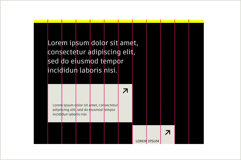
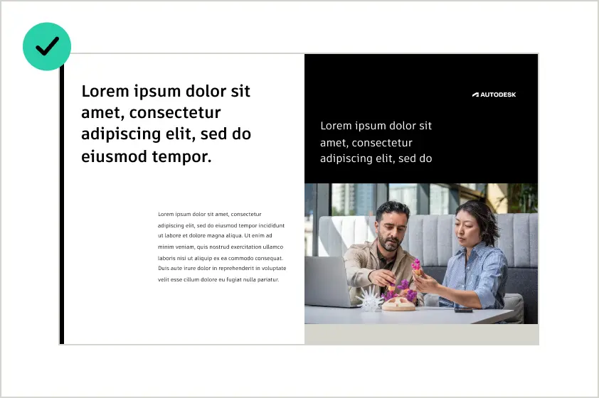
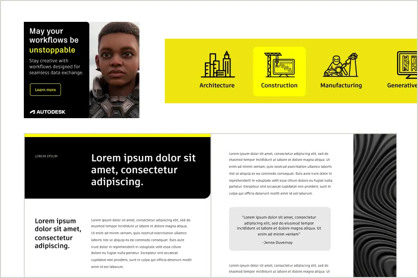
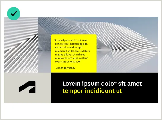
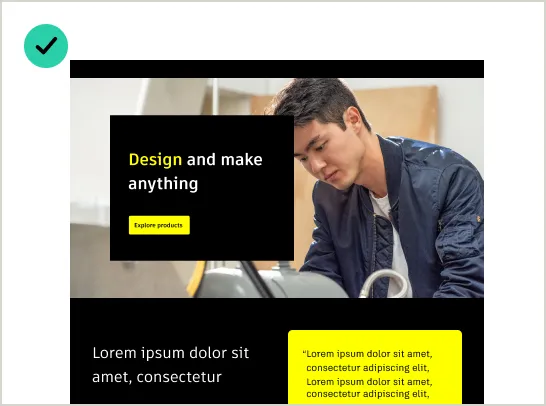
The grid and color blocking work together to create designs that are bold, balanced, and adaptable. The grid provides structure, while color blocking adds energy and focus, ensuring every layout aligns with our brand identity.
The grid ensures precise alignment and consistent spacing, guiding the placement of text, images, and color blocks for a balanced layout.
Color blocking defines sections and draws attention to key content. The use of Autodesk Black and Autodesk White Yellow ensures clarity and focus.
Flexible by design Copy link to clipboard
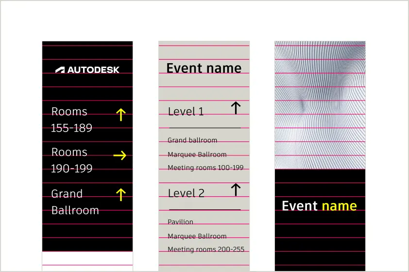
The grid and color blocking adapt seamlessly to different formats, from web and social media to print and presentations.
Applying the grid Copy link to clipboard
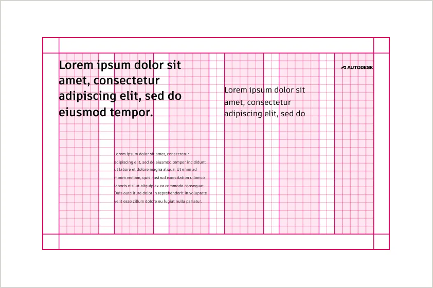
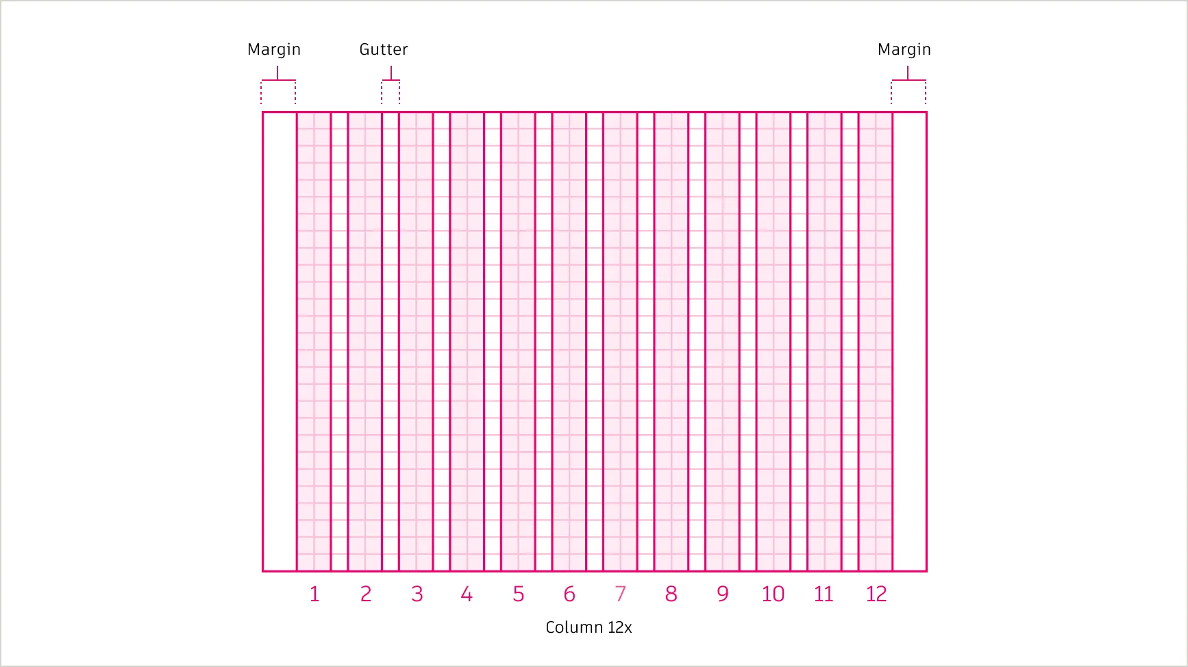
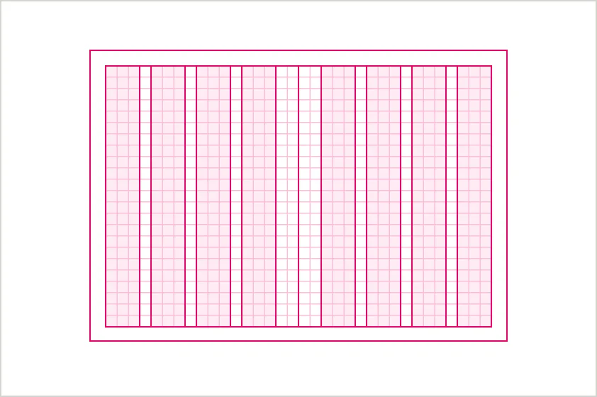
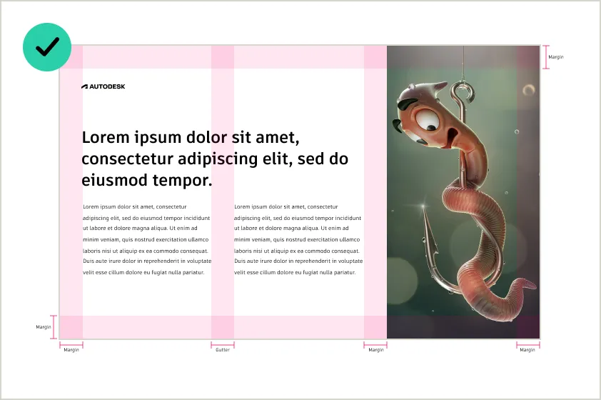
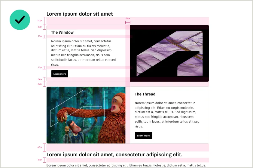
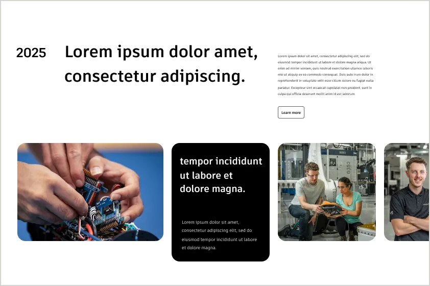
The grid is the backbone of our visual system, providing structure and consistency across every design. Built on a modular 4px base, the grid ensures elements align precisely while remaining adaptable to different formats. By using columns, rows, gutters, and margins, the grid helps create layouts that are balanced, clean, and scalable.
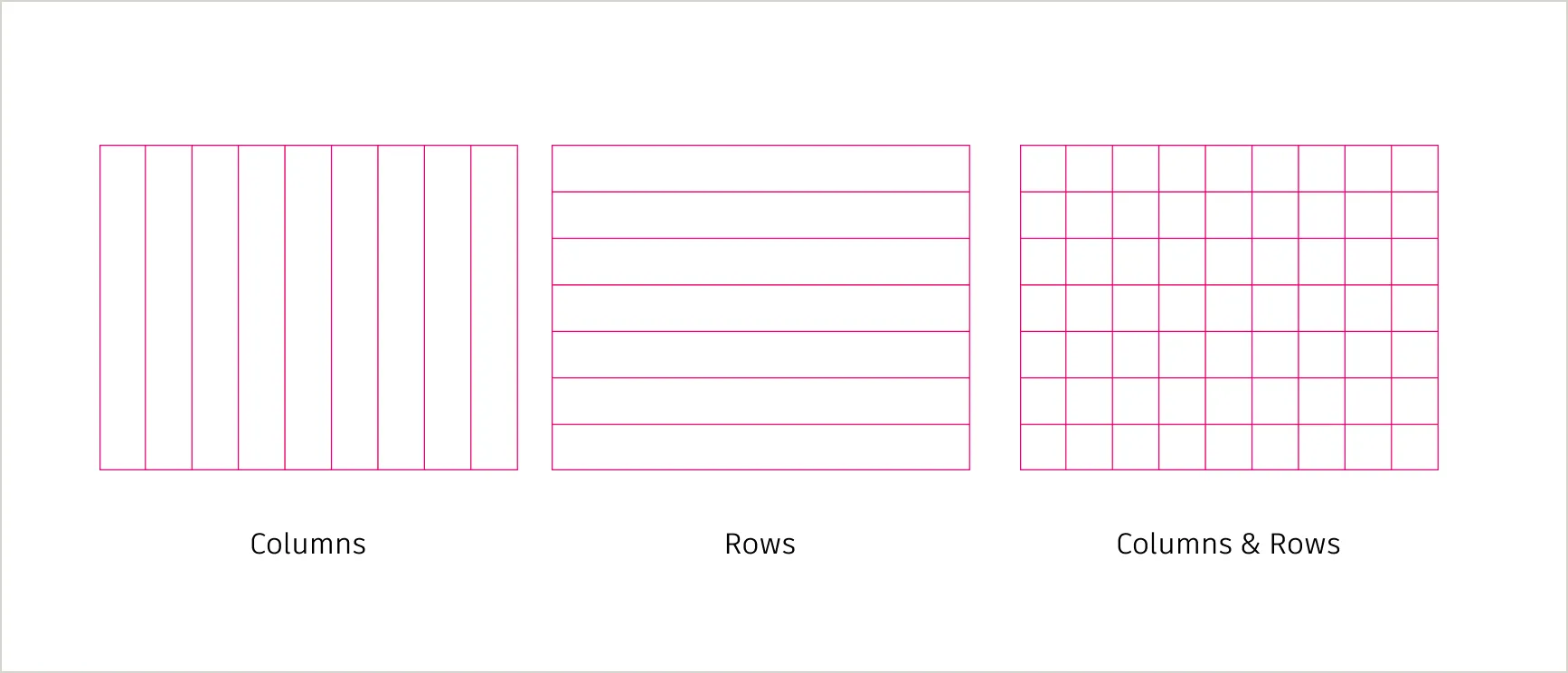
Columns and rows Copy link to clipboard
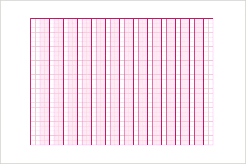
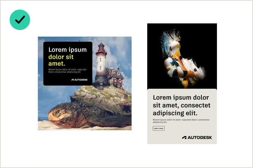
Columns create vertical divisions across the layout, defining areas for content like text, images, and graphics. Rows provide horizontal alignment, ensuring consistent spacing between sections and elements. Together, columns and rows create a balanced and organized structure for web, print, and presentations
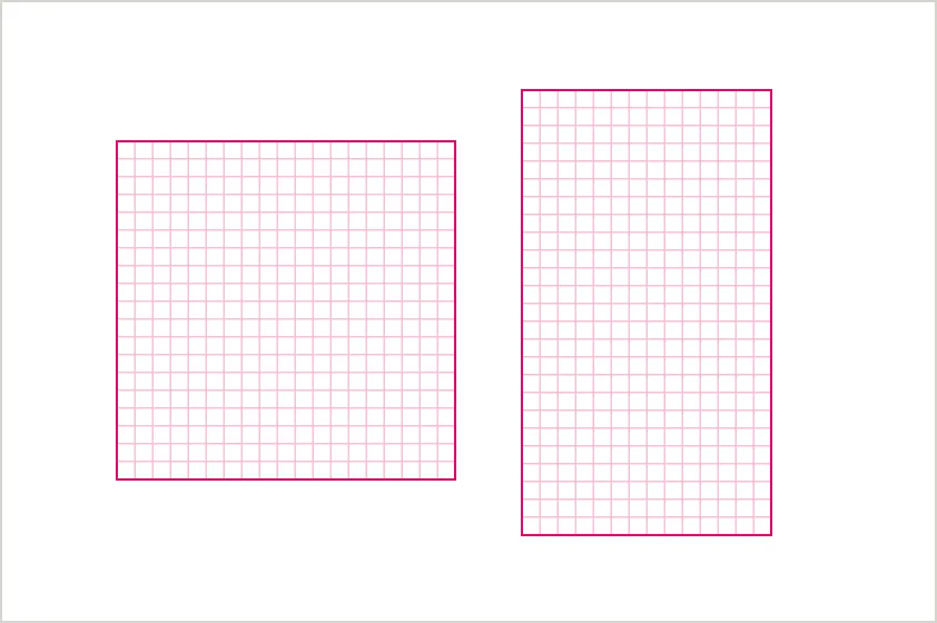
Columns only
Rows only
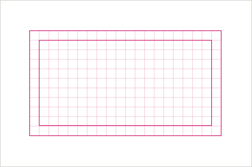
Margins and gutters Copy link to clipboard
Margins and gutters can be used to create space between elements and maintain visual balance within a layout. Gutters help separate content, while margins frame the edges of the design, providing breathing room and an intentional look. Depending on the design needs, adding margins and gutters can enhance clarity and make layouts feel more spacious, but they may not always be necessary for every composition.
When used, both elements should align with the 4px base grid to ensure consistency across formats.
Scalability across formats Copy link to clipboard
The 4px base unit is the smallest measure in our system, forming the basis for all spacing, alignment, and layout decisions. This modular approach allows elements to align precisely, ensuring designs are balanced and scalable across all formats, from digital to print.
Web
Use a 12-column grid with responsive gutters and margins for flexibility.
Apply modular grids to divide pages into structured sections.
Social and ads
Use modular layouts for balanced designs across various aspect ratios.
Slides
Use a modular grid to align titles, images, and visuals in presentations.
Checklist for using grids in our brand layout Copy link to clipboard
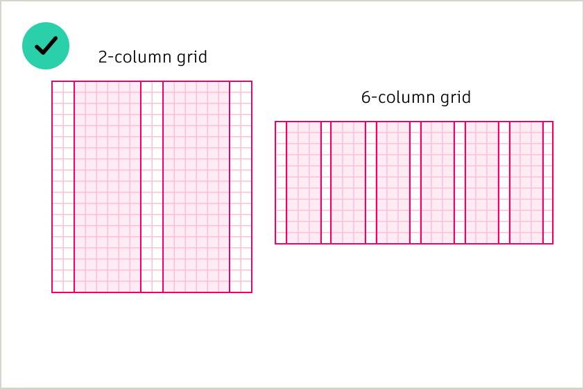
DO use consistent column divisions (e.g., 2, 4, 8, 12) across your layout to maintain balance.
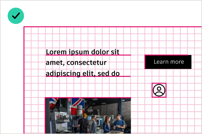
DO align all elements—text, images, buttons—to the grid for clean and intentional designs.
DO use gutters and margins to create breathing room between content and edges.
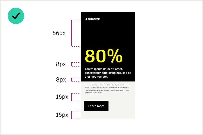
Do use multiples of the base unit (1x, 2x, 3x, 4x, 6x, 8x, 10x, 12x) to define all spacing between elements.
DO align all color blocks to the grid for clean, structured layouts.
DO apply rows and vertical rhythm to maintain even spacing between sections.
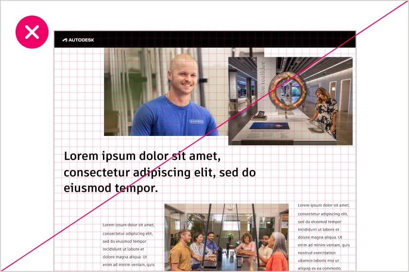
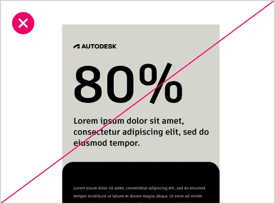
DO NOT place elements randomly or misalign them from the grid—it disrupts visual harmony.
DO NOT skip gutters or margins, as it makes content feel cramped.
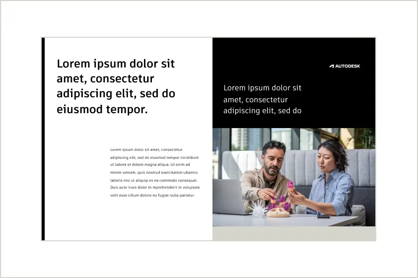
Color and imagery Copy link to clipboard
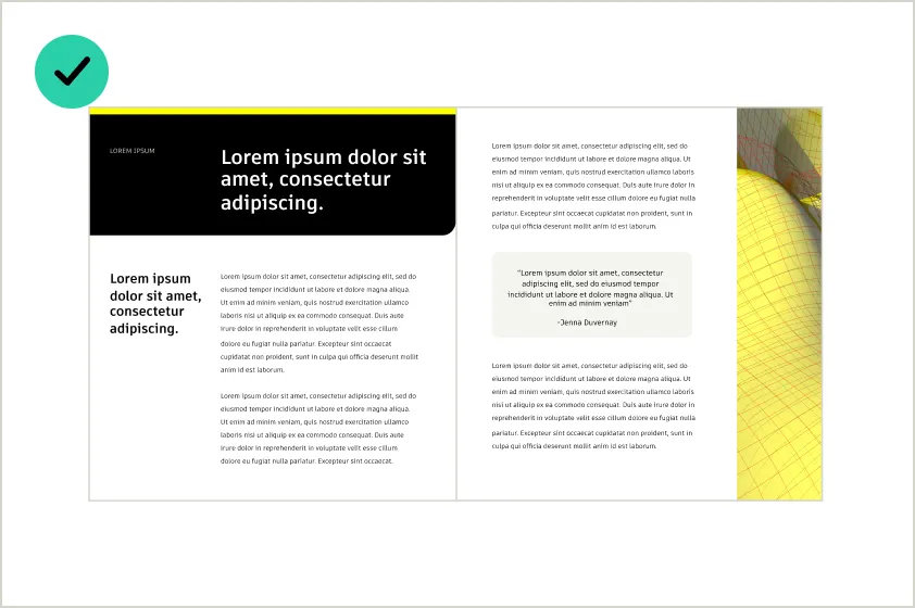
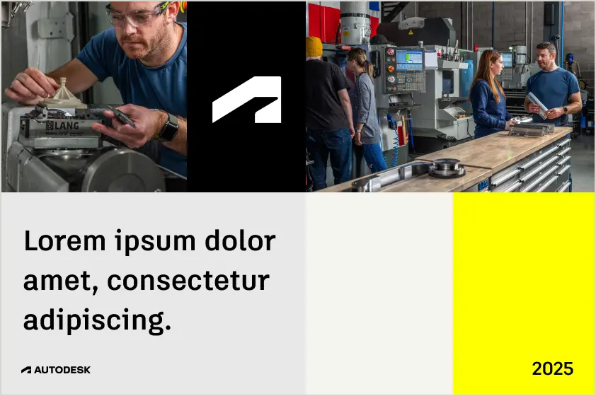
Color and imagery work together to bring energy, hierarchy, and clarity to our designs. By combining bold color blocks for primary emphasis, lighter tints or secondary colors for supporting sections, and high-quality impactful images aligned to the grid, we create layouts that are visually dynamic, balanced, and unmistakably ours. These principles ensure every design remains flexible and cohesive, regardless of format.

Using color to define hierarchy Copy link to clipboard
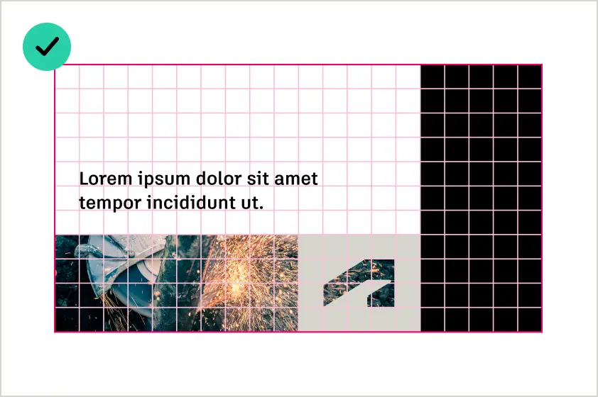
Color blocking defines the most important elements of a layout. Autodesk Black and Autodesk White dominate, creating bold sections that emphasize headlines, CTAs, or visuals. Secondary colors add contrast and guide attention, ensuring the viewer’s eye moves naturally through the design.
Proportions and balance Copy link to clipboard
Hello Yellow and tertiary colors should make up no more than 15% of the layout, ensuring Autodesk Black, Autodesk White, and imagery remain the primary visual elements (see Color proportions and usage). Images and color blocks should work together to maintain hierarchy and avoid visual clutter, creating a balanced and cohesive design.
Integrating images into the grid Copy link to clipboard
Color and imagery work together to bring energy, hierarchy, and clarity to our designs. Combine bold color blocks with impactful images, aligned to the grid, to create layouts that are visually dynamic, balanced, and unmistakably ours. These principles ensure every design remains flexible and cohesive, regardless of format.
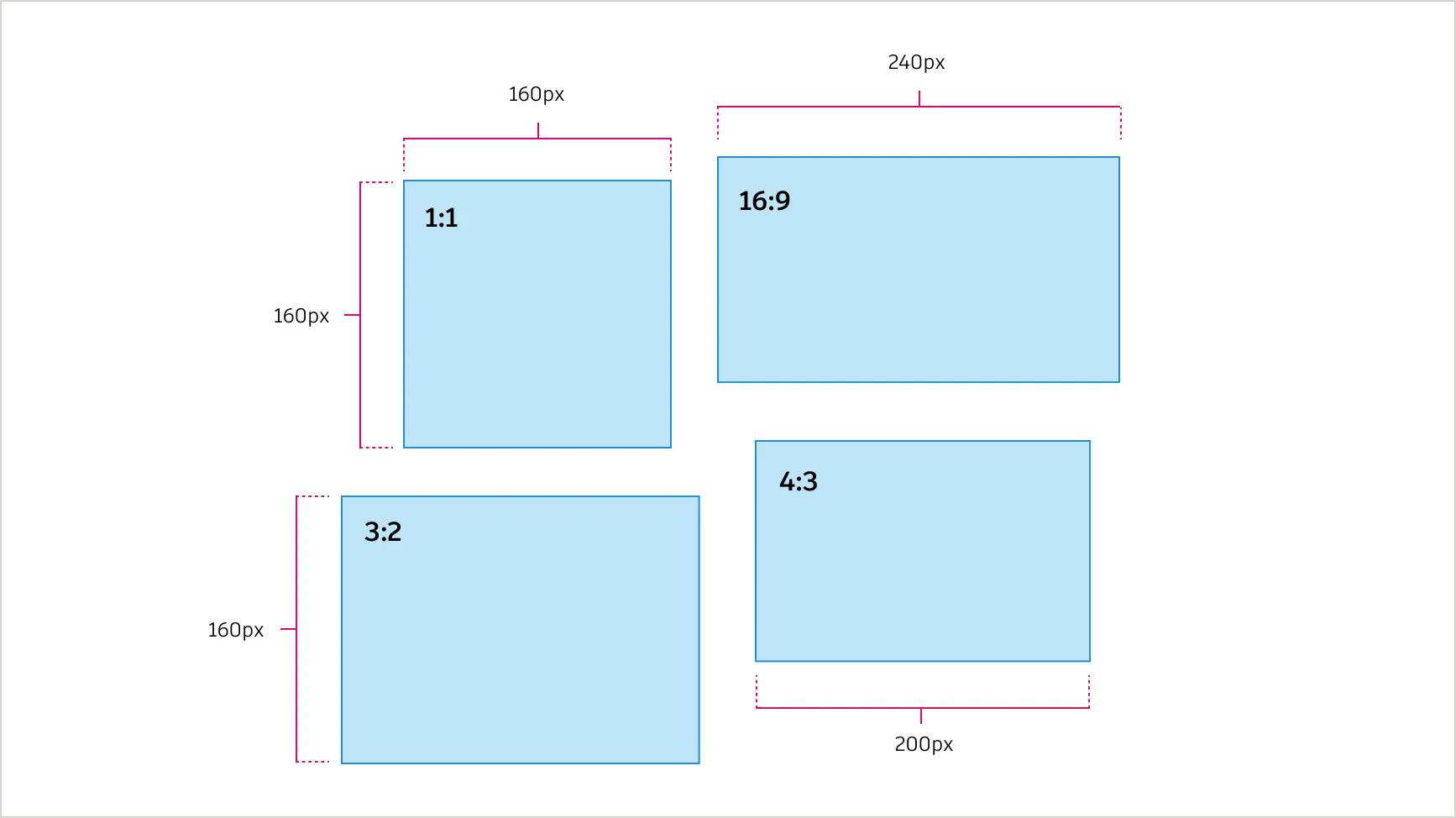
Images must scale proportionally with the grid. Copy link to clipboard
To ensure consistency and alignment, images must scale proportionally with the grid. Recommended ratios include:
- 1:1 (Square): Perfect for thumbnails, social posts, or modular layouts;
- 4:3 (Standard): Suitable for general-purpose content like presentations and print;
- 16:9 (Wide): Best for hero sections, full-width banners, and videos;
- 3:2 (Classic): Great for photography or visually rich content.
Dimensions
Ensure that image dimensions align to multiples of 4px (e.g., 400px x 300px for a 4:3 image). When cropping, always maintain the original ratio for proper alignment.
Alignment tip
Align one dimension to a multiple of 4 while ensuring the other aligns proportionally.
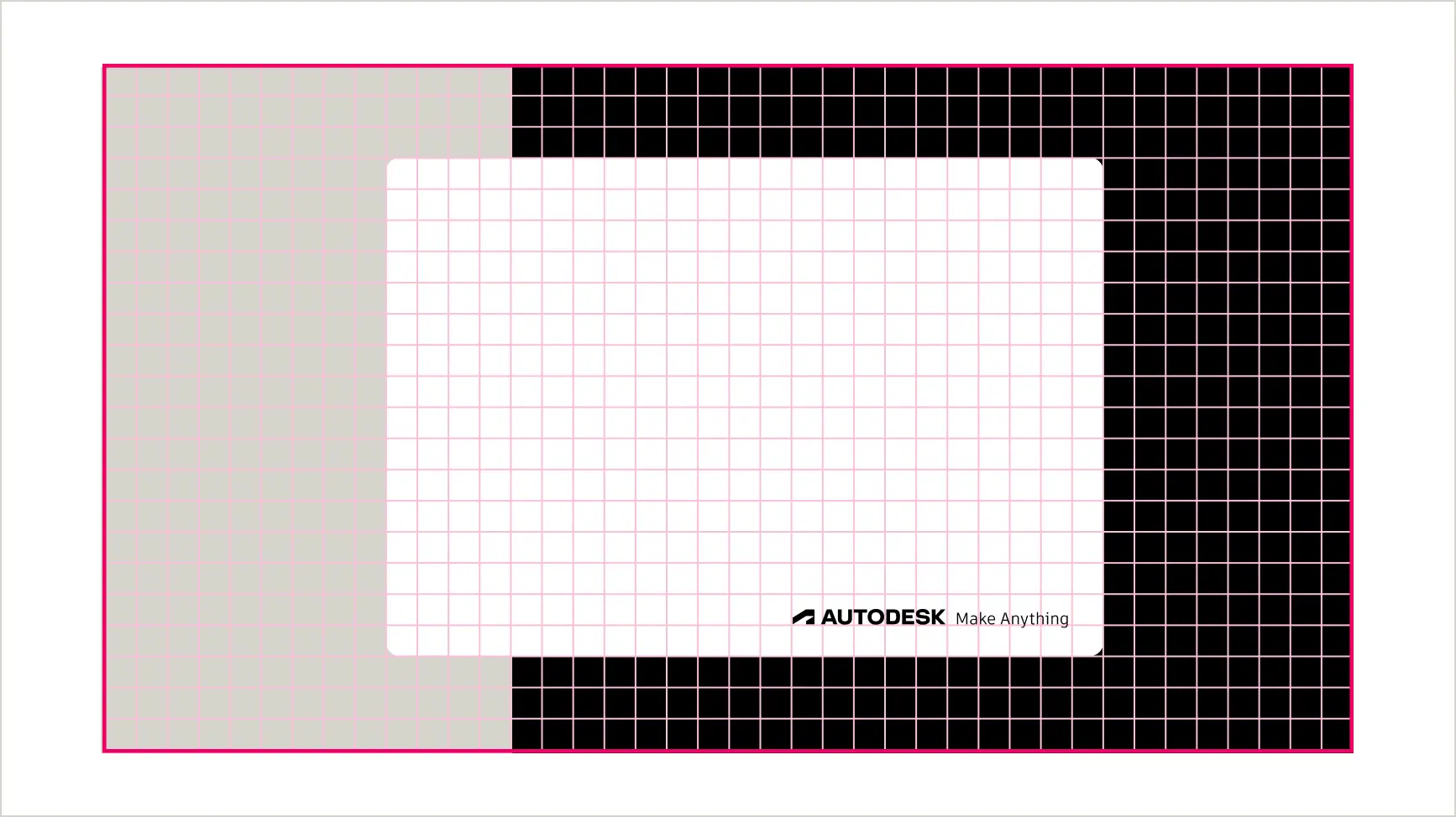
Clear space for text and elements Copy link to clipboard
To maintain clarity and consistency across various design sizes, the clear space around type can scale proportionally based on the overall size of the design. This ensures that smaller designs remain legible and larger designs maintain visual balance, the minimum clear space around text and elements should relate to the size of the type and align with the grid system.
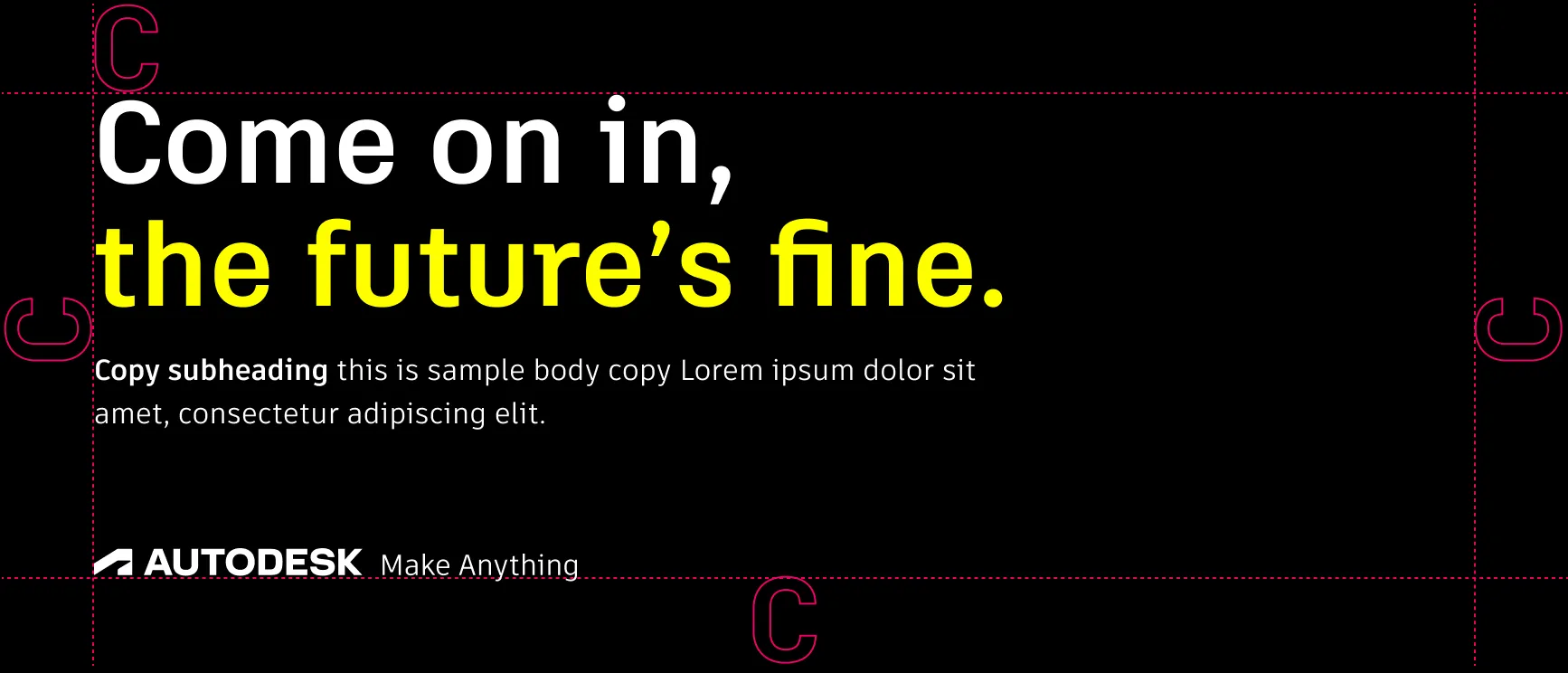
The minimum clear space around text and elements is equal to 1x the height of the largest capital letter in the text block (e.g., “C”), rounded up to the nearest multiple of the grid unit (e.g., 4px, 8px, etc.). For smaller text sizes (e.g., body copy), use 1.5x the line height to provide additional breathing room for readability.
Checklist for using color and imagery in the layout system Copy link to clipboard
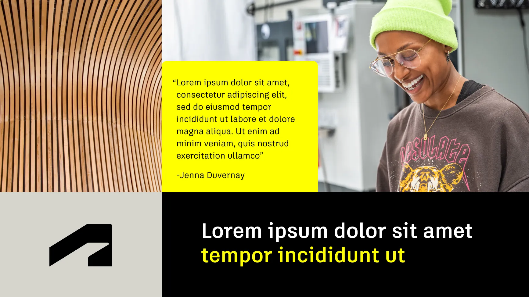
DO use bold blocks of Autodesk Black and Autodesk White for primary emphasis, then Hello Yellow and lighter or darker tints and shades of secondary colors for supporting sections.
DO use primary colors as the dominant colors, making up 85% of the palette.
DO use the window and the thread selectively to emphasize key sections or highlight important areas in the design. Avoid overusing it in a single layout.
DO use images within structured layouts that support clear visual hierarchy.
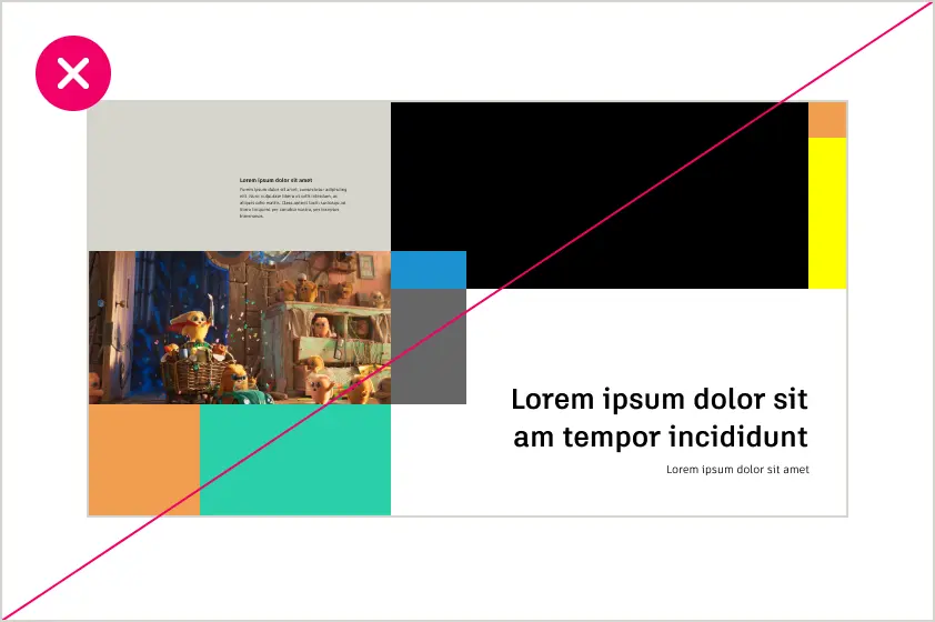
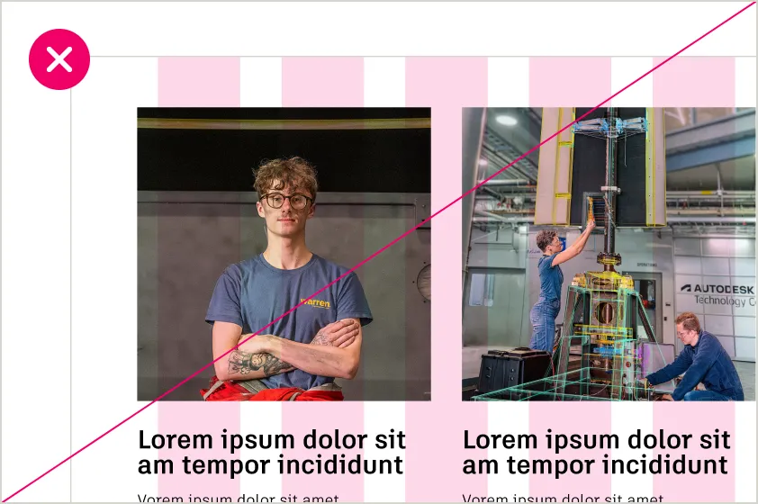
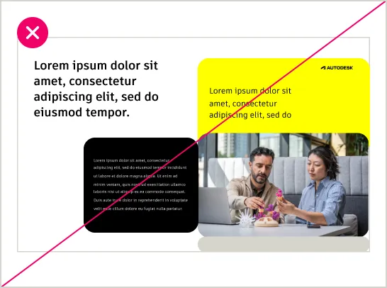
DO NOT overuse secondary or tertiary colors. Use them sparingly— for accents only.
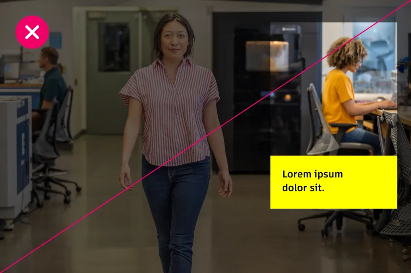
DO NOT crop images in a way that removes key focal points.
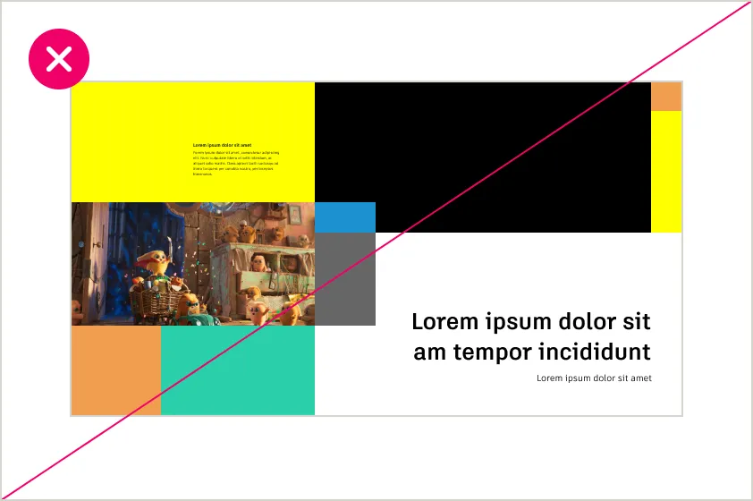
DO NOT overuse color blocks, which can lead to overly complex or crowded designs.
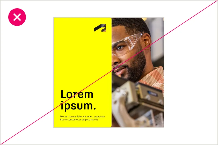
DO NOT use massive blocks of Hello Yellow or crop images awkwardly.
Rounded vs. sharp corners Copy link to clipboard
The purposeful use of rounded and sharp corners creates a balance between approachability and precision in our designs. When deciding which to use, consider its purpose and strive for balanced compositions. Rounded corners add softness and focus to interactive or decorative elements, while sharp corners convey structure and clarity.
Radius scale Copy link to clipboard
Rounded corners create a polished and cohesive look across all elements. The radius scale is designed to align with the 4px grid, ensuring consistency and scalability across designs. By applying the right radius size for the element, you can maintain visual harmony and reinforce the brand’s identity.
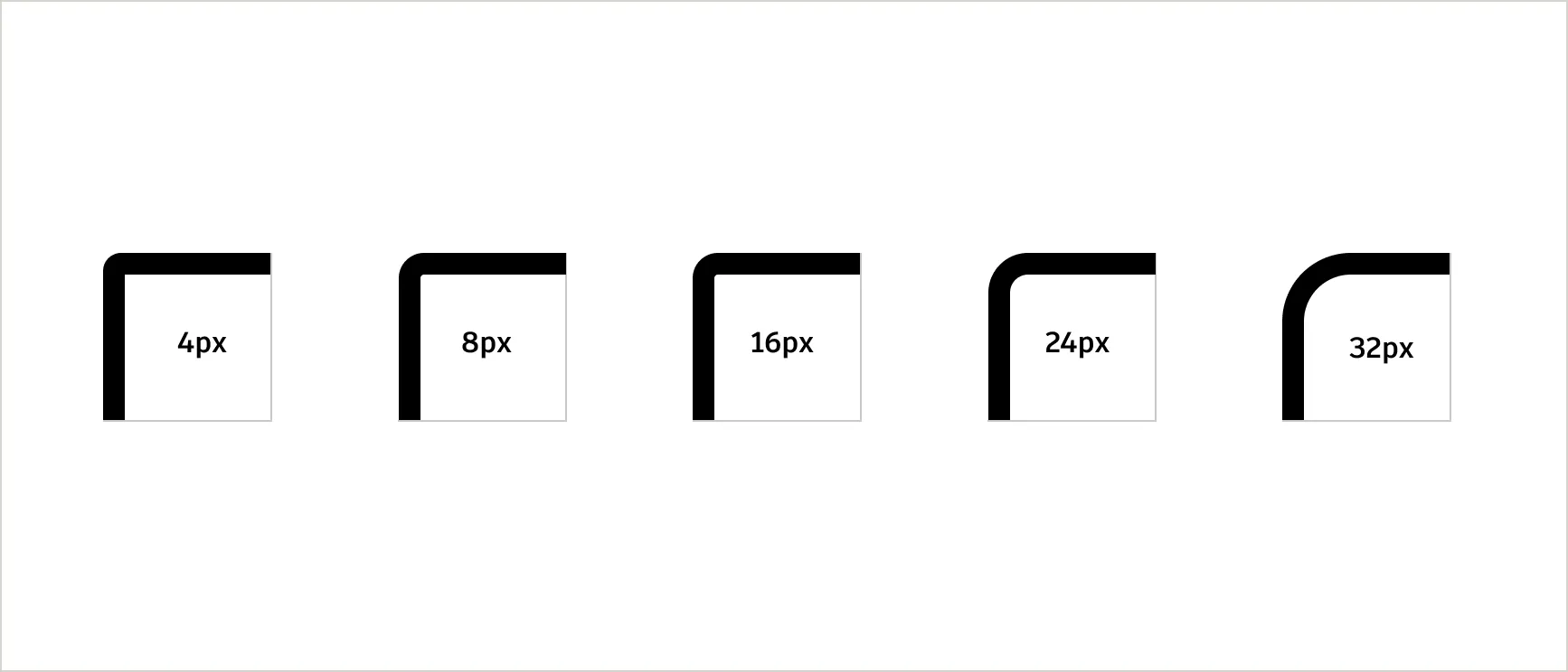
Always match the radius size to the purpose and size of the element. Use larger radii, such as 24px, 32px, or 48px, sparingly to create emphasis while avoiding overuse. Ensure all rounded elements align precisely to the grid to maintain a cohesive and polished design.
- 4px: For small elements like buttons, tags, and compact UI elements.
- 8px: For slightly larger UI elements such as input fields or small cards.
- 16px: For medium-sized elements like standard cards or containers.
- 24px: For larger components like modals or section dividers.
- 32px: For prominent visual elements, such as banners or hero sections.
Usage Copy link to clipboard
Rounded corners are best for emphasizing specific elements, such as callouts or buttons, while sharp corners establish structure and balance. Sharp corners convey precision and order, making them ideal for grids, sections, tables, and professional layouts where clarity and consistency are key. Combining rounded and sharp corners within a layout can create visual contrast and guide focus, but it should always serve a clear purpose.

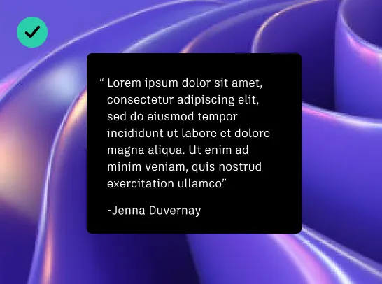
Highlighting standalone elements
Use fully rounded corners for isolated elements like callouts, standalone cards, or featured content.
Creating focus
Use rounded corners to guide attention to key content. For example, callouts, quote blocks, or interactive features like buttons can benefit from the visual emphasis created by rounded corners.
Softening layouts
In clean and minimalist designs, fully rounded corners add a modern, approachable touch while maintaining visual balance.
Provide alignment and structural balance
Sharp corners are ideal for structural elements like grids, containers, and layout dividers. They emphasize precision, alignment, and organization, ensuring the overall design feels grounded and cohesive.
Checklist for using round and sharp corners Copy link to clipboard
Combining rounded and sharp corners in the same layout can create contrast and guide focus, but it must be done with a clear purpose. Rounded corners are used to highlight specific elements, while sharp corners provide structure and balance.
DO apply rounded corners to emphasize specific elements like quote blocks or interactive features.
DO use sharp corners for grids, images, or layout containers to provide alignment and structural balance.
Do leverage rounded corners to distinguish interactive or decorative elements from structural ones.
DO NOT combine rounded and sharp corners without a clear reason, as it can confuse the viewer and reduce impact.
DO NOT use rounded corners excessively, as it might weaken the design’s structural integrity.