Our proprietary typeface, Artifakt, helps communicate our brand personality and signals to viewers instantly that they’re connecting with Autodesk.
Artifakt was designed for Autodesk’s exclusive use in a partnership with renowned type designer Erik Spiekermann of Edenspiekermann. Copyrighted by Autodesk, Artifakt is free for all employees and suppliers for use solely in creating and using Autodesk assets.
The sections below outline how to acquire Artifakt and when to use it, when to use system fonts if Artifakt is not an option, and how to use Artifakt successfully in various applications.
IMPORTANT: Microsoft PowerPoint, Word, and Excel, and email apps (Outlook, Mail, etc.) can’t embed proprietary typefaces like Artifakt. Native files to be distributed outside Autodesk and email must use Arial. PDFs can use Artifakt. See details in Using Artifakt.
Artifakt Designer collection Copy link to clipboard
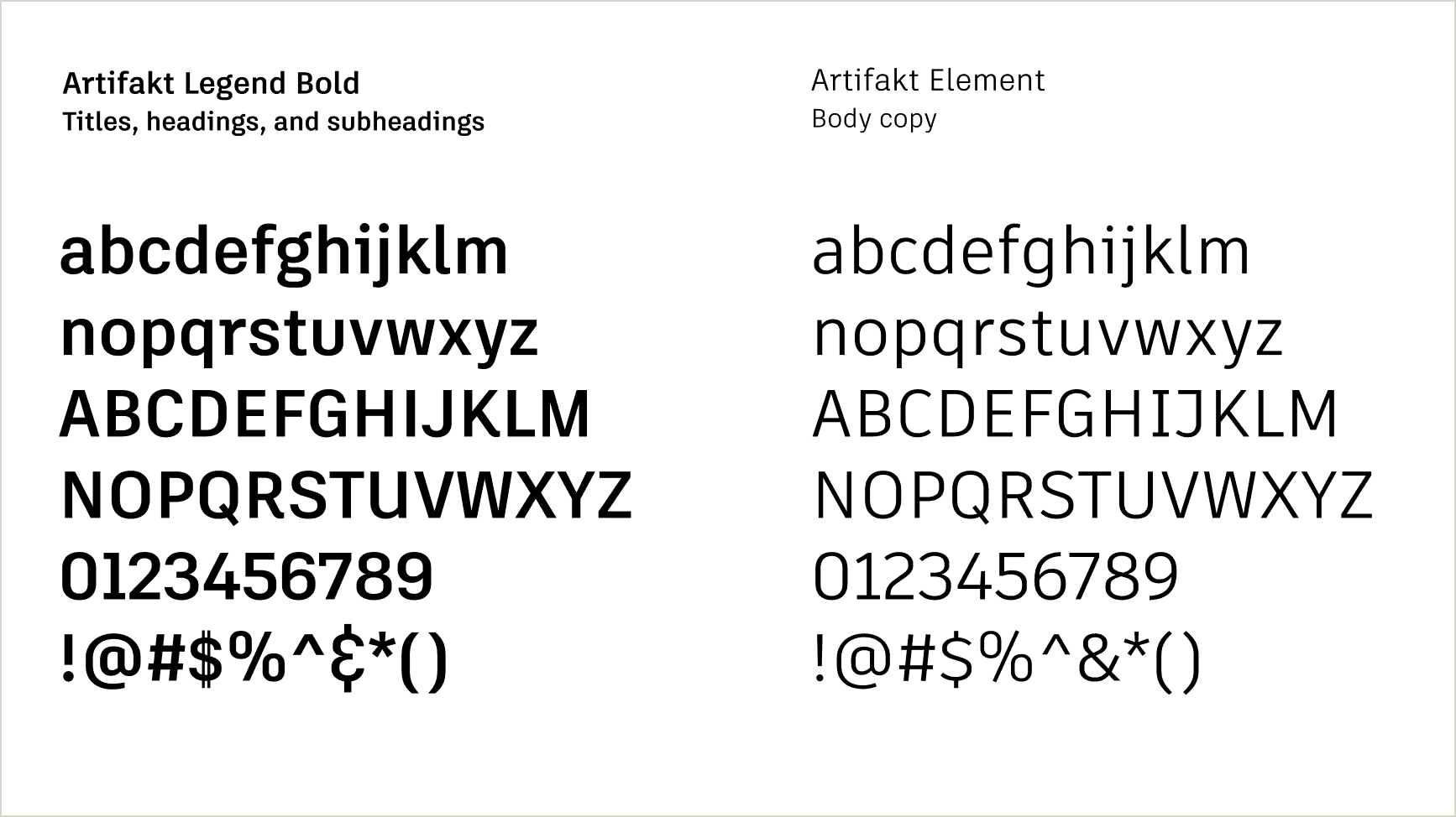
Artifakt is a deep font family providing general users, designers, and developers a wide variety of design options. The designer collection, our primary font package, accommodates complex design systems, type hierarchies, and printing techniques. It includes both Artifakt Legend and Artifakt Element families, each with nine weights, plus their italic versions. It is also what we use in our logo system, tagline lockups, and product interfaces.
Applications:
- Internal uses of Microsoft PowerPoint, Word, Excel, or Keynote for Mac
- Adobe Creative Cloud (InDesign/Photoshop/Illustrator, etc.), and most development and web applications
- NOT for Outlook/email unless in a graphic (see System typeface below)
Uses:
- If your file will always be used on an Autodesk corporate machine that has Artifakt loaded, it is safe to use Artifakt.
- If sharing your file externally, save and distribute it as a PDF.
- Use Artifakt for all print collateral, videos, branded merchandise, and most other assets.
- Use Artifakt for Autodesk-owned websites.
- Artifakt is the basis for our logo systems, including all product identities (note these must be created by our Brand team).
- Artifakt should also be used inside our product interfaces. Contact #weave (access required) for more information.
- Always use Arial for email.
System typeface Copy link to clipboard
Use Arial if the text will be read or editable on a computer or device where Artifakt is not installed. Microsoft PowerPoint, Word, and Excel, and email apps (Outlook, Mail, etc.) can’t embed proprietary typefaces like Artifakt. Native files to be distributed outside Autodesk and email must use Arial. This prevents Artifakt from being replaced with another font by default for the viewer. You may, however, use Artifakt if your document will be distributed as a PDF.
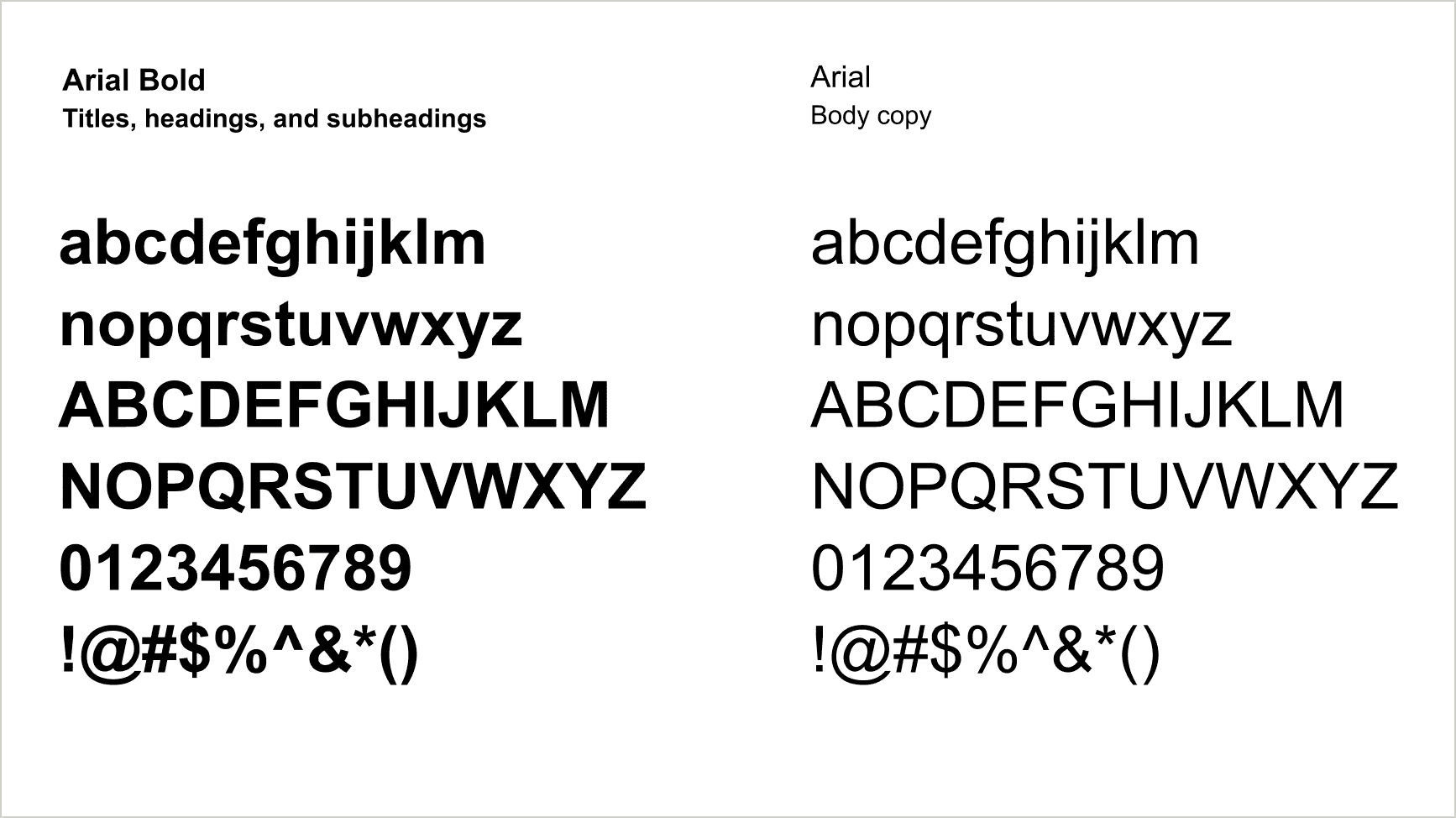
When using Arial, use the same rules as you do for Artifakt. See Weights and styles under Using Artifakt.
Double-byte character languages Copy link to clipboard
Artifakt is currently unavailable for languages that use double-byte characters. In web settings, system default fonts will display in those regions. For print and other non-website usage, the localization team recommends Noto Sans, a Google font that supports multiple languages, for double-byte characters. For more information, including a list of double-byte default system fonts, consult our Asian Font Text wiki (login required) created by the Autodesk localization team.
FAQs Copy link to clipboard
Who can and should use Artifakt
Artifakt is available to all employees, suppliers, and channel partners with their agreement to the licensing terms below. Everyone creating assets for Autodesk should use Artifakt as their primary typeface whenever possible.
What are the licensing terms?
© Autodesk, Inc. All Rights Reserved. The Artifakt font software is Autodesk proprietary and confidential, and may be used only by authorized users and only for Autodesk business purposes. Any use not authorized by Autodesk is not permitted and is an infringement of Autodesk’s intellectual property rights as well as a breach of your agreement with Autodesk.
Does my supplier need to purchase Artifakt?
Artifakt is available for free to anyone creating Autodesk assets on behalf of Autodesk, Inc., but it is Autodesk-copyrighted material. Artifakt can only be used by Autodesk suppliers for Autodesk purposes. Suppliers must agree to the licensing terms listed above before downloading and using Artifakt.
How is Artifakt distributed internally and externally?
Employee deployment
ESE (Enterprise Systems & Experiences) automatically pushes Artifakt Designer files to every employee machine currently electronically managed by and accessible to ESE. If you are able to receive updates from ESE, you should see Artifakt show up in your Microsoft Office font menus–your machine may require a restart for your programs to recognize the font menus. For employee machines that aren’t accessible by ESE, the font is available for download from the DAM (access required) and must be manually installed by the user.
Supplier and channel marketer deployment
Artifakt is available for download on the DAM (access required).
What styles are included with Artifakt?
Artifakt Designer includes both Artifakt Legend and Artifakt Element families, each with nine weights, plus their italic versions.
How do I install Artifakt?
Once you have Artifakt downloaded, follow the instructions below to install it in your device.
- Find the zipped folder in your Downloads folder and unzip it. The folder will include a variety of formats: TTF, EOT, SVG, WOFF, and WOFF2.
- Choose the appropriate formats you’ll need for the following use cases:
- Microsoft Office programs—TFF
- Adobe Creative Cloud, static or print design—OTF
- Mobile, responsive, program UIs—SVG
- Web design—EOT, TTF, WOFF, WOFF2
Now choose your platform to finalize installation.
PC computers:
Select, drag, and drop Artifakt font files into the Fonts Control Panel. This is faster with multiple files. Or double-click on each font file and click the “Install” button.
You may need to restart your machine before Artifakt shows up in your font menus.
Mac computers:
Launch Font Book in your Applications folder. Select, drag, and drop Artifakt font files into your Font Book list. Or drag the font folder(s) into your Fonts library folder on the base level of “Macintosh HD.”
You may need to restart your machine before Artifakt shows up in your font menus.
What languages and formats are included with Artifakt?
The Artifakt typeface contains all Latin and Cyrillic characters and their italic versions (120+ languages, including English, French, German, Italian, Polish, Russian, Spanish, and Swedish).
There are multiple formats included to ensure that the designers and developers can easily implement the new system: TTF, OTF, SVG, WOFF, WOFF2, EOT.
Artifakt is not available for double- and multi-byte characters. The localization team recommends Noto Sans, a Google font that supports multiple languages, for such characters.
Where and how do I use Artifakt?
Artifakt should be used in all print collateral, signage, videos, branded merchandise, and our online experiences, UNLESS the text will be read or editable on a computer or device where Artifakt is not installed.
You must use Arial for all email content (HTML or plain text) and any native Microsoft Word, PowerPoint, or Excel, or Keynote, etc., documents that will be distributed externally. This will prevent a device from substituting Artifakt for an alternate font if Artifakt isn’t installed locally. You may, however, use Artifakt if your document will be distributed as a PDF.
General Artifakt usage guidelines are included above in the Using Artifakt tab. More detailed guidelines for web are included in Digital experiences.
Who do I contact for information?
For installation issues you can contact ESE in various ways:
- Submit a ticket through ServiceNow (employees only)
- Use the Lumi app in Slack or Autodesk One
- Call +1-415-507-8888
- mail the HelpDesk at help@autodesk.com
For questions about usage or implementation please email brand@autodesk.com.
Weights and styles Copy link to clipboard
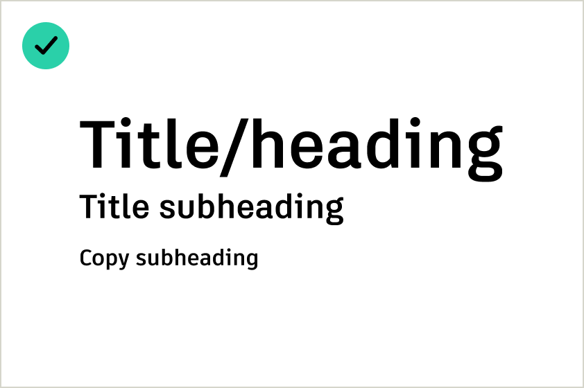
Titles and subheads
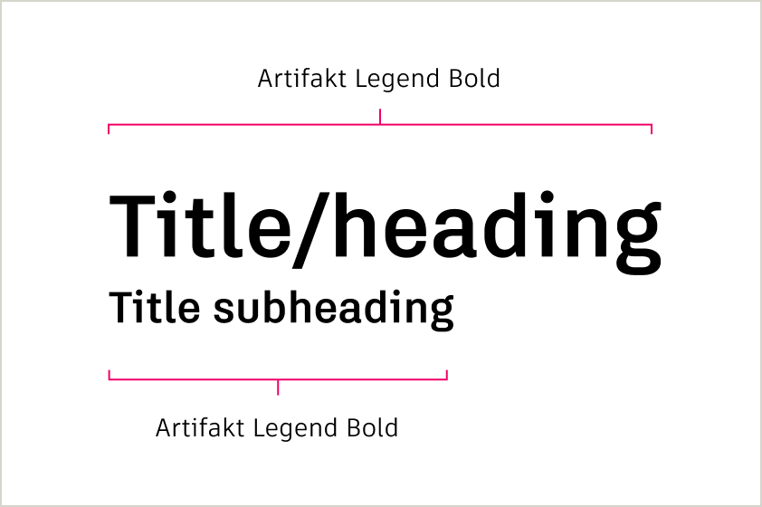
Titles, headings, and title subheadings should appear in Artifakt Legend Bold. These are written in sentence case and without a period at the end of the sentence unless they consist of more than one sentence.
Some exceptions apply. See Digital experiences.
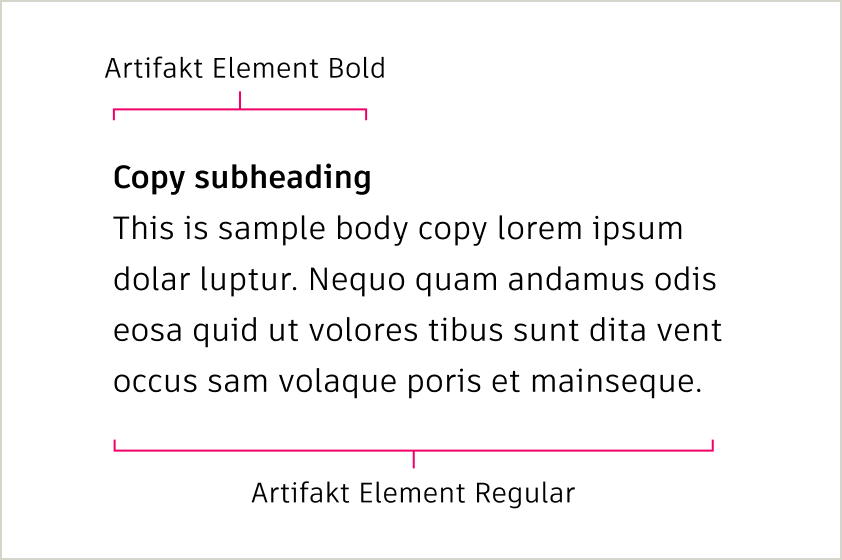
Subheadings over body copy should appear in Artifakt Element Bold. Body copy should be Artifakt Element Regular. Subheadings are written in sentence case and without a period at the end of the sentence, unless the subheading consists of more than one sentence.
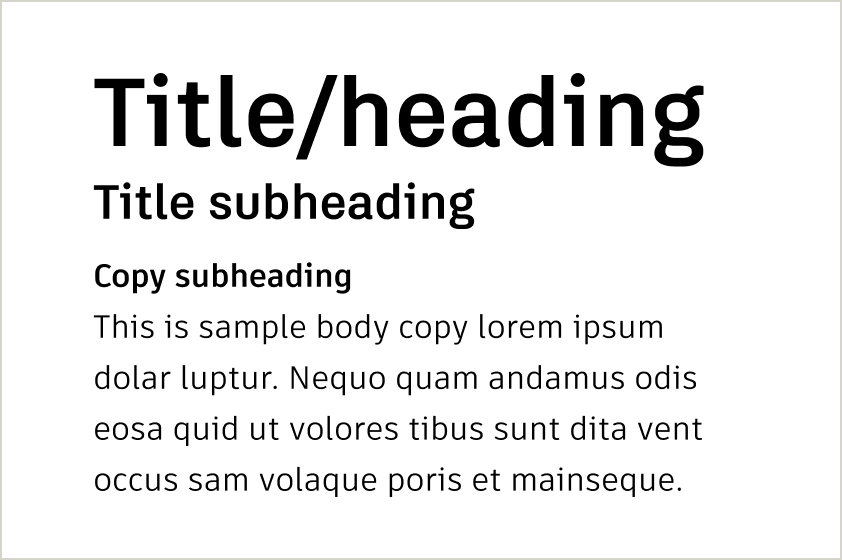
When dealing with multiple levels of information, make sure there are clear text hierarchies.
Size different levels of titles and subheadings proportionally and consistently. Please note, this is a general guide and elements should be adjusted to match your application.
Body copy
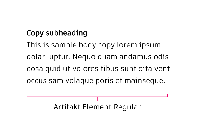
Body copy should always be set in Artifakt Element. Kerning (space between letters) should be set to Optical in Adobe products. As a rule, smaller type sizes need more leading (space between each line of text) to be read comfortably; larger type sizes need less leading
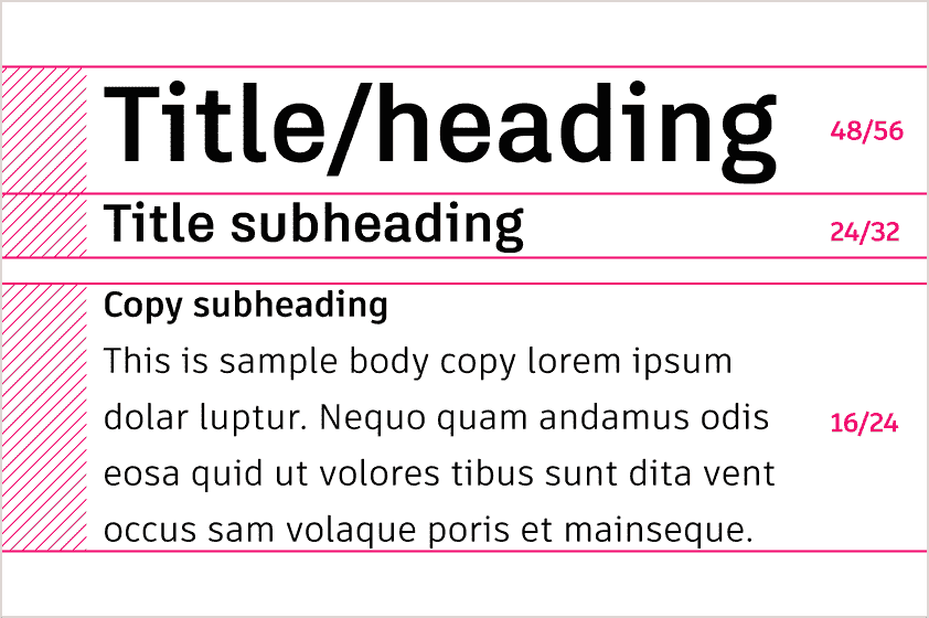
Size and line spacing Copy link to clipboard
Our type size and line spacing (leading) are designed to work seamlessly with the 4px grid, ensuring alignment and consistency across all layouts. By following these guidelines, you can maintain visual balance and readability in any design.
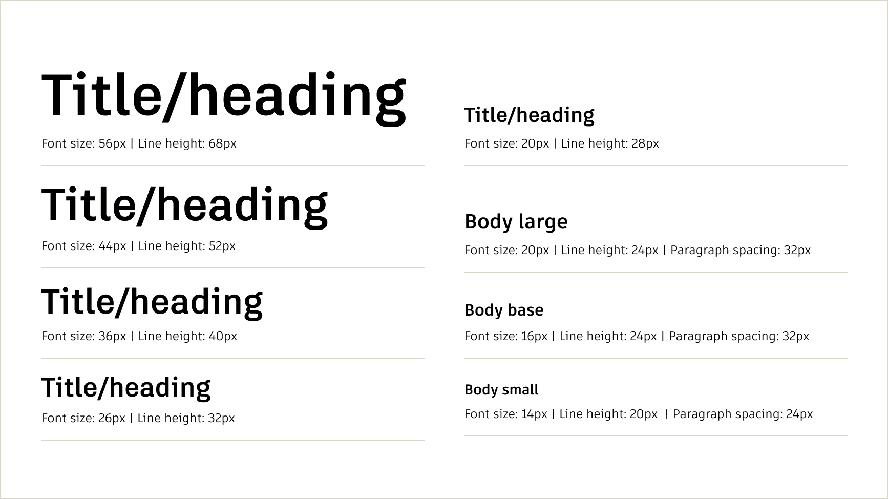
Recommended sizes and line height
To ensure vertical alignment with the grid, the combination of font size and line height must result in a height divisible by 4px. Line height refers to the total vertical space for each line of text, including the text itself and the space above and below it. For example, a font size of 16px paired with a line height of 24px creates a total line height of 24px, which aligns perfectly to the grid.
When spacing text blocks, always use padding or margins in multiples of 4px to maintain consistent alignment and visual rhythm.
Text color Copy link to clipboard
Text must always be legible against its background. Most text should be either Autodesk Black or Autodesk White. However, when using Autodesk White text against an Autodesk Black background, Hello Yellow can be applied at the end of a headline to add emphasis. Always choose the text color based on accessibility and never pair Autodesk Black text with Hello Yellow text.
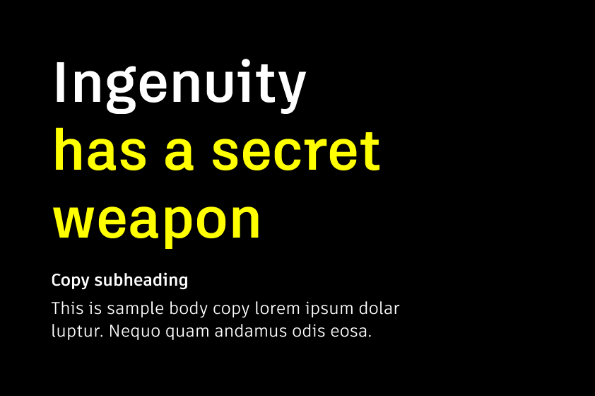
Headlines on Autodesk Black backgrounds can be a combination of Autodesk White and Hello Yellow. Always start with Autodesk White and use Hello Yellow to provide emphasis for key words or payoffs to the headline.
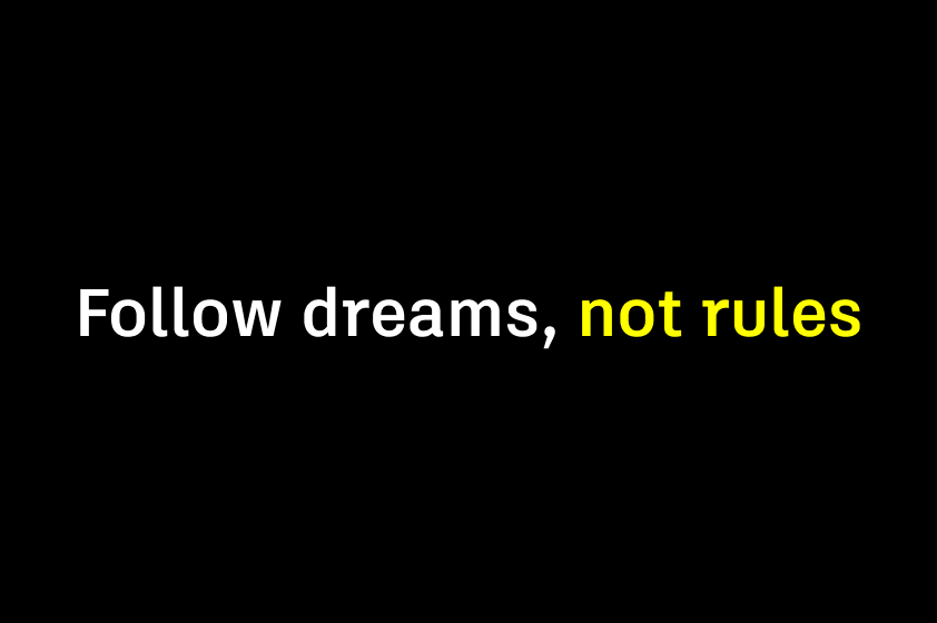
For one-line headlines, start with Autodesk White and highlight key words or payoffs to the headline in Hello Yellow.
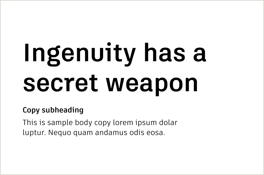
Autodesk Black is the preferred text color on Autodesk White backgrounds to ensure maximum readability and accessibility.
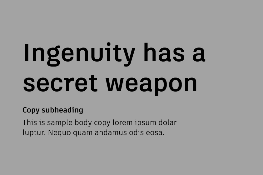
Autodesk Black is the preferred text color on gray backgrounds to ensure maximum readability and accessibility.
Typography checklist Copy link to clipboard
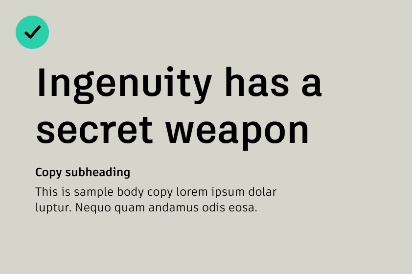
DO prioritize readability and accessibility by using Autodesk Black on light or neutral backgrounds
DO ensure headlines follow a hierarchy.
DO ensure headlines follow a hierarchy.
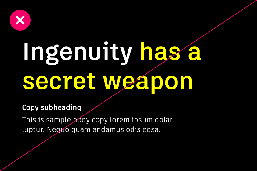
DO NOT mix Autodesk White and Hello Yellow in the middle of a phrase or across line breaks.
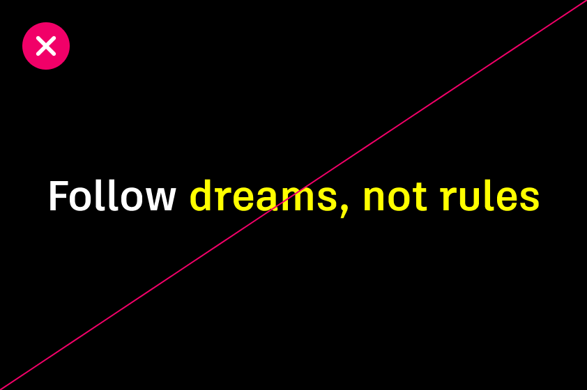
DO NOT highlight awkward or random words in Hello Yellow—keep it clear and intentional.