Video
Videos are a powerful way to bring our stories to life and enhance our brand. They showcase innovative work and highlight how we partner with our customers to enable incredible outcomes.
To keep our brand strong, our videos must be recognizably Autodesk. The key is consistency. Color choices, logos, and fonts are the most obvious visual elements to consider.
We are also thoughtful in how we use motion in our videos. We don’t add text effects or animation for fun or to make a video unique. We use motion graphics to draw the viewer’s attention to a certain part of the screen, usually to read text. Once the viewer has had time to read the text, we add a simple one-second fade out.
When creating video, please use the guidelines and templates below.
Titles and sections
Consistent treatment of video titles and sections reinforces the Autodesk brand. Two title templates are available:
- Main title: a more complex graphic animation created to highlight your video theme.
- Section title: a simpler title that provides more room for text. The section title also works well to indicate a series of videos.
These templates are set up for you to easily update text layers and replace footage with your content. Simply change the indicated text in the template and add the title to your edit.
Use a one second fade between the title and your edit. Feel free to adjust the text layout if needed. Be sure to use the Artifakt font.
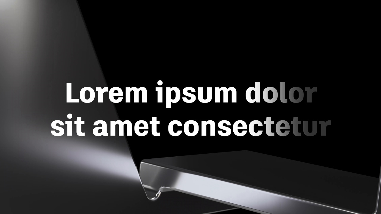
The main title template (access required) is available as an After Effects file only. It is designed for short titles of one or two lines. If you are creating an asset that needs more room for text, use the section title instead.
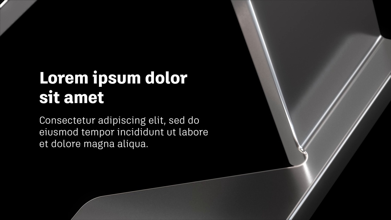
The section title template (access required) is available as an After Effects file. If you use another editing software, we also include QuickTime movies, PSD files, and reference movies that allow you to recreate these titles in an editing software.
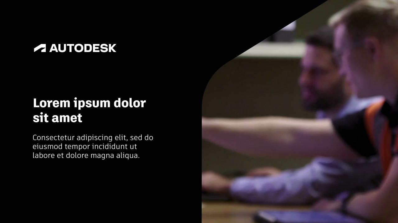
The custom content title templates (access required, After Effects only) are designed to highlight your initiative’s imagery, copy, and, if applicable, Brand-approved logo while still adhering to the parent brand framework. Both black and white versions are available to accommodate your video’s aesthetic.
Lower thirds
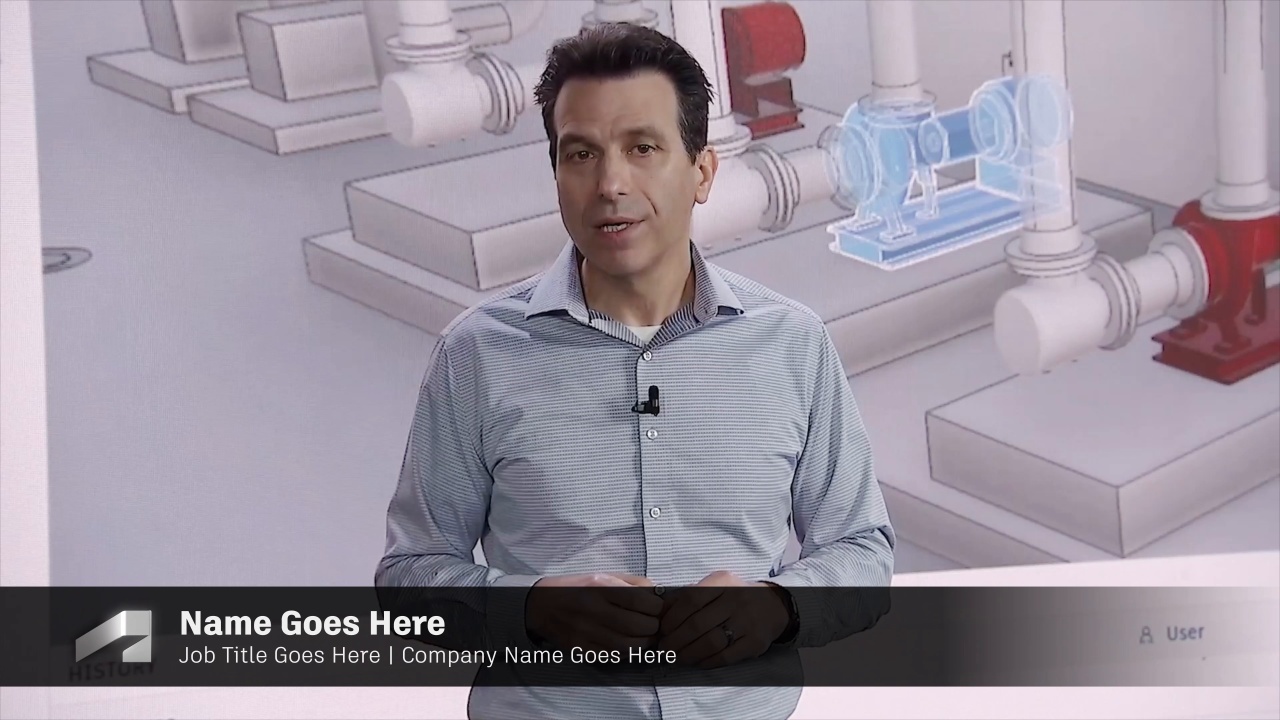
A standard lower third convention is used to identify employees, customers, and other people in our videos. We recommend displaying the speaker information in a two-line configuration, as laid out in the template file.
A lower third template (access required) is available in After Effects format. To maintain consistency with other videos, do not adjust type sizes.
Logo placement
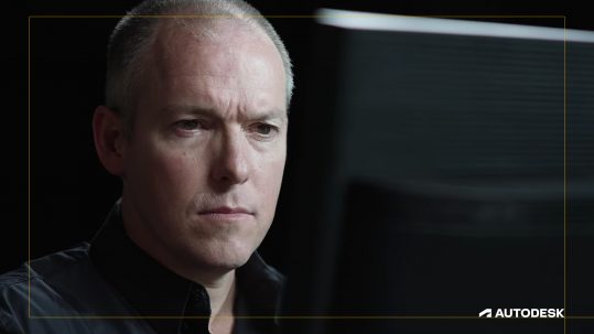
Standard logo placement
Position the Autodesk logo in the lower-right corner inside the video safe frame. During titles, sections, lower thirds, or transitions, the logo should not be shown. If there is a client logo burned in the footage (for example, during demo reels), place the Autodesk logo in the upper-right corner. The standard logo template (access required) is available in 4K and 1080p resolutions.

Standard symbol placement
To improve legibility on mobile devices, use the Autodesk symbol instead of the full Autodesk logo. In most cases, the symbol placement is the same as the full Autodesk logo, which is in the bottom-right corner. If you are using captions or subtitles, you can place the symbol in the upper-right corner. The social media symbol template (access required) is available in 4K and 1080p resolutions.
Video credits
Credits and calls to action (URLs and so on) are placed before the final logo end frame. Typography guidelines should be followed, with the option to center text for credit rolls.
NOTE: Any violation of copyright agreements could damage goodwill with customers and opens Autodesk up to legal liability. Always secure usage rights for all imagery, artwork, video, music, sounds, and voice talent. Add credits when required and always route your content to your Legal partner for approval.
The video credit template (access required) is available in 4K and 1080p resolutions.

Logo intro and outro
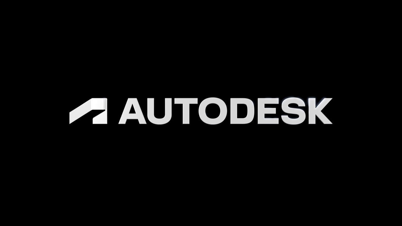
Intro
When your video calls for emphasis of Autodesk from the get-go, use the intro animation (access required) for an impactful opening.
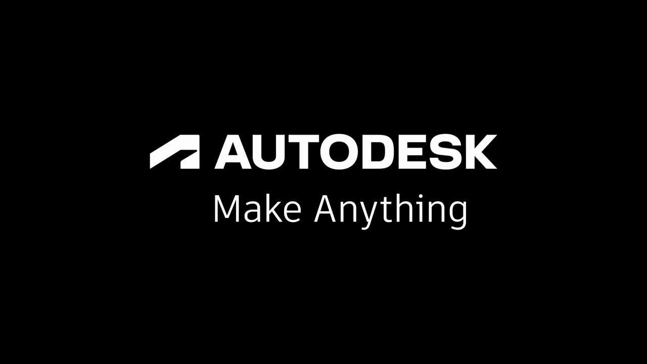
Outro
Credits and calls to action (CTAs) are always followed by the two-line Autodesk logo tagline lockup. Use an animated outro or a simple static end frame, which should fade in with a three-second hold (all links require access).
Audio
When crafting videos, sound is an integral part of the creative process. By using the power of sound, we engage customers, increase awareness, and build a stronger emotional connection with our audience.
Voiceover
Voiceover is as important to the overall brand impression as what is on the screen. Use these guidelines to ensure that the story you’re trying to tell is not just seen but heard.
Selecting the right voice
Voiceover talent representing the Autodesk brand should embody the company personality. The voice should be assured and confident, without being arrogant. It should always be open and approachable. It should not sound stilted or scripted.
It doesn’t matter whether the voice is male or female, so long as it makes a positive impression and connects with the audience. It also must be understandable and clear. If there are any doubts about this and you can’t choose a different voice, adding subtitles is a must.
Natural and conversational delivery
The Autodesk brand voice is accessible. The voiceover should represent the company’s approachability and openness, with a natural delivery and conversational rhythm. A little character is great. But, to ensure that your piece doesn’t sound like a hard sell the voiceover should not be overly stylized or dramatic. Nor should it sound like a lecture.
Local talent
When creating a video for a particular geo, use local talent if possible. Customers are more likely to watch a video if they feel it has been created with them in mind. Local narrators go a long way in doing this.
Pro tip: a new voiceover track or subtitles can efficiently and cost-effectively adapt existing video to local markets.
Music
Music is a powerful and emotional. It’s another medium to tell your story and connect with your audience. When selecting a song for your video, consider the following:
Music tells its own story
The most important factor to consider when picking a music track is whether it helps you tell your story. Ask yourself: does the arc of your track match the arc of your video? Does it follow the same emotional path as the content? Does it end where you need it to end: on a high or low note, resolved or unresolved? No matter how good the track is, if it isn’t relevant to the context, or doesn’t elevate your story, it’s the wrong track.
Pay attention to the tone
Finding the right song is as much about finding the right tone as anything else. Consider how the instrumentation and vibe of a song complement the story you’re telling. Complement, however, doesn’t mean match. If you’re making a video about a technology solution, don’t immediately reach for music with synthesizers and drum machines. Sometimes a tonal mismatch can have a memorable effect.
Keep it instrumental
We recommend instrumental tracks, especially when creating touch points with narration or voice over. That doesn’t mean the music has to stay in the background. Finding ways to seamlessly integrate voiceover with music that has a strong melody or hook will help your video (and your message) stick in your audience’s mind long after it’s over. If you decide to select a track with lyrics, be aware of the message of the lyrics and how that relates to your content. Is it conflicting with your touchpoint objectives? Is it competing with the dialogue or content? If so, you may want to consider selecting a new song.
Let music inspire the edit
Music shouldn’t be the last step in the process. Use your selected music track to help guide and edit your piece. This will inspire an even stronger bond between the music and the content.
For further guidance, including recommendations on audio resources, contact brand@autodesk.com.
